Design process
Design thinking

Empathize
Find what users need and learn how to think and feel like them.
- UX research
- User interviews

Define
Define the challenge based on the information gathered about the users.
- User persona
- Competitive audit

Ideate
Brainstorm focusing on the quantity of the ideas more than the quality to come up with the ideal solutions.

Prototype
A scaled-down version of a product that shows essential functions.
- Wireframes
- Lo-Fi Prototype
- Mockups
- Hi-Fi Prototype

Test
Test the prototype with users.
Understanding the user
User research

I conducted user research with two types of users, one who had experience helping the environment and the other who barely knew about the topic. My goal was to find out how much they knew about the importance of pollinators and how much they would be willing to spend and do to help them.

I assumed that both types of people would prefer to donate, but surprisingly they also chose to build a garden to help those species.
User persona
After analyzing the user research data, I created two types of user persona that helped me understand the user’s needs, behavior, demographic, goals, and frustrations. These fictional characters summarize and communicate the data collected in the research in a more accessible way and allow me to design the project having the user in mind.

Sara
“I like to be part of the solution, not part of the pollution”
Demographic
Age: 20
Location: San Diego, CA
Education: University student
Job: Volunteer planting trees and flowers to help wildlife.
Brief
Sara is a 20-year-old woman who loves to be part of the change on the planet. She’s in college and likes to volunteer to plant trees every month to help wildlife. She would love to have an eco-friendly startup and use her savings to donate to Nature Conservancy. She recently read about the importance of pollinators and would love to volunteer to help them. She gets frustrated when people don’t care about helping the environment.
Goals
- Finish college
- Have an eco-friendly startup
- Keep volunteering to help endangered wildlife
- Use her savings to donate to Nature Conservancy
Frustrations
- People not caring about the environment.
- Not having easy and attractive ways to engage people to help the planet.

Laura
“I’m trying to change my habits and be more aware”
Demographic
Age: 30
Location: Monterrey, Mx
Education: Master’s Degree
Job: Business Strategy Manager
Brief
Laura is a 30-year-old plant lover trying to be more eco-friendly. She believes it is never too late to start the change. Her goal is to be a zero-waste person and learn more about the best plants to grow to attract bees and hummingbirds. She’s taking a certificate to be a Climate Leadership to teach her friends and family to follow her path and make an impact on the planet, but she gets frustrated because it is hard for her to change her friend’s habits.
Goals
- Be a zero-waste person
- Create a pollinator garden
- Get a Climate Leadership Certificate
Frustrations
- Gets frustrated by trying to teach friends to change their habits
Competitive audit
It's essential to research similar products/projects that already exist to examine their interactions, visual design, information architecture, and content. After research, I analyzed the data collected to understand some of the pain points of other similar projects, consider them, and improve mine, so it stands out from the rest.
The projects I looked into to create the competitive audit:

Pollinator Partnership
First impressions
On the desktop, the first impression was good, easy to navigate with good usage of animation without being overwhelming. It has a responsive website, but the menu stopped working after scrolling down.
Interaction
The website don’t have any engaging features. It just has the button “Donate now.”Accessibility needs improvement because sometimes the font size is too small, or the contrast isn’t readable.
Visual design
The site layout is simple, clean, and easy to follow. Some buttons (or clickable items) are hard to find because they’re inconsistent in shape and color. As said in “Interaction,” some font sizes are too small, and some colors don’t make a good contrast making it hard to read.
Content
The website has a good balance between the information and the visuals.

World Wild Life
First impressions
The website has a clean design, is visually appealing, and is easy to navigate. The World Wildlife Fund responsive website has a better layout design, is more visually appealing, and is easy to navigate.
Interaction
The website don’t have any engaging features. It only has a button to “Donate” and another to “Adopt.”
The accessibility of the website is good, it has keyboard accessibility, and the font sizes and contrast are readable. But, it only has the language option to change it to Spanish.
Visual design
The site layout is simple, clean, and easy to follow, with a clear brand identity.
Content
The website has a good balance between the information and the visuals.

World Animal Foundation
First impressions
World Animal Foundation has a responsive website. It’s easy to navigate but not very visually appealing.
Interaction
The website doesn't have engaging features. It doesn't have any accessibility options.
Visual design
The site layout is not appealing. The font size doesn't have consistency, and the color of the fonts sometimes is hard to read because of the pictures used as background.
Content
The website is overwhelming because there’s no balance between the white space and the content.

The National Wildlife Federation
First impressions
The website has a clean design, is visually appealing, and is easy to navigate. The World Wildlife Fund responsive website has a better layout design, is more visually appealing, and is easy to navigate.
Interaction
The website don’t have engaging features, just a “Donate” button.
The accessibility needs improvement because when using the keyboard is not working correctly, and there’s no option to change the language.
Visual design
The visual design is very appealing, has good contrast in colors, a clear branding identity, and some engaging icons; but the font size is not consistent, sometimes is too small, and is hard to read.
Content
The website has a good balance between visuals and text.
Ideation Process
Crazy Eight
For my ideation process, I used the Crazy Eight method, which is a fast sketching brainstorming exercise where I sketched eight different designs, for the website and the app, in eight minutes.
Then I selected the designs I liked the most and what I thought would be functional for the users.
Starting the design
Digital wireframes
Lo-Fi Wireframes

Usability study
After the usability study, I looked at the insights received and prioritized them to change the wireframes based on the users' needs. I re-designed the Lo-Fi Prototype and iterated it until the users were comfortable with the design.

Most users had trouble searching for how to buy seeds, so I changed the feature “Spot them” to a “Shop” section.

Users also wanted more information on the plants they’ll get/have.

Users found the “add to garden” button confusing, so I change it to a secondary button with more text explaining what it does.
Lo-Fi Wireframes after usability study

Mockups
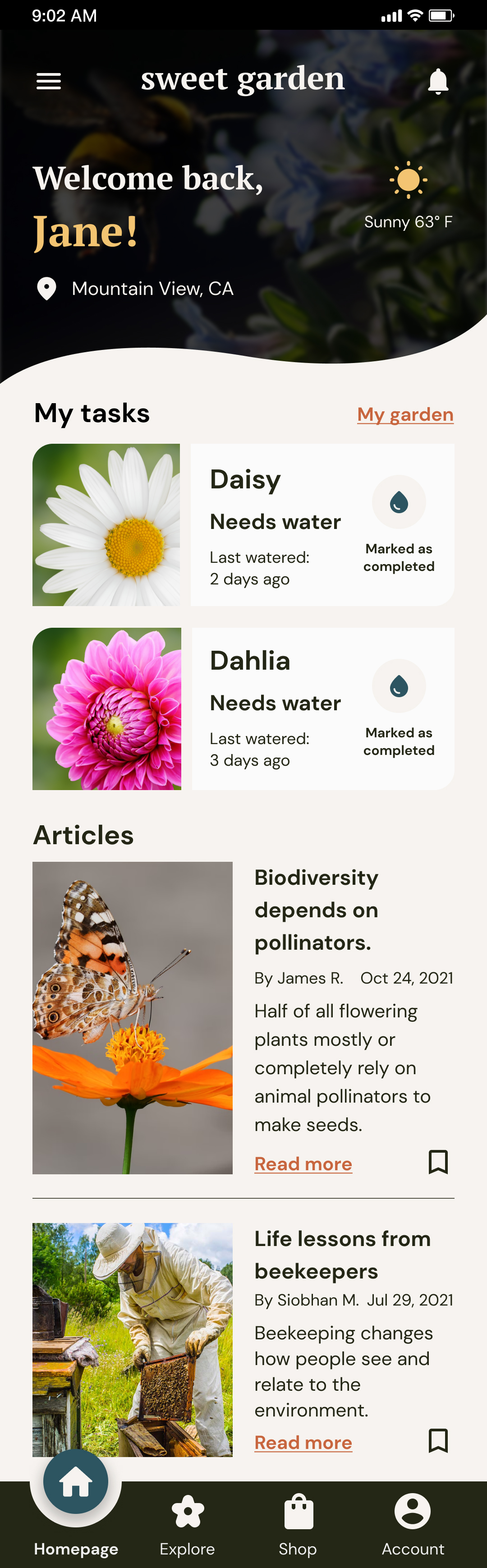
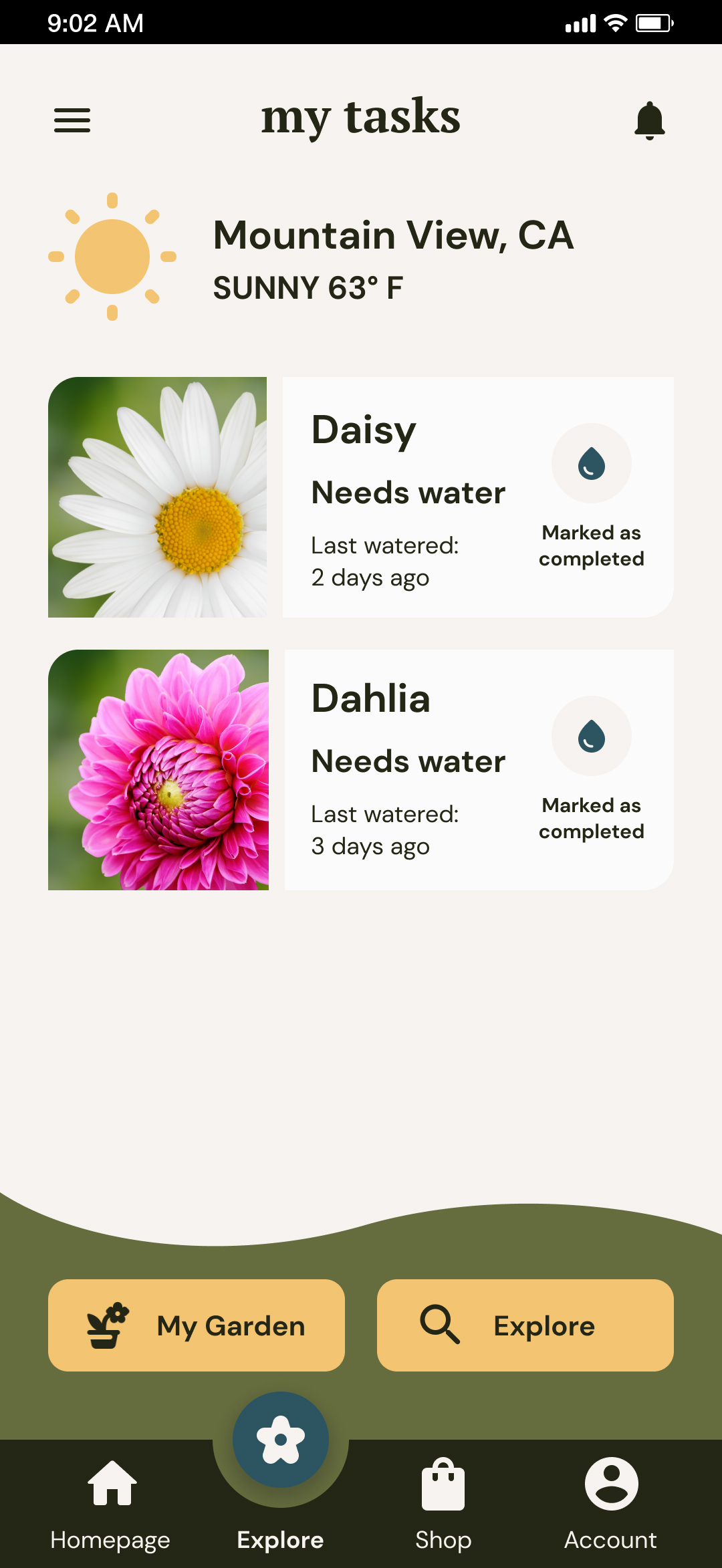
Homepage and Explore
Homepage of Sweet Garden. The users will find the task of the day, interesting articles and even the weather.
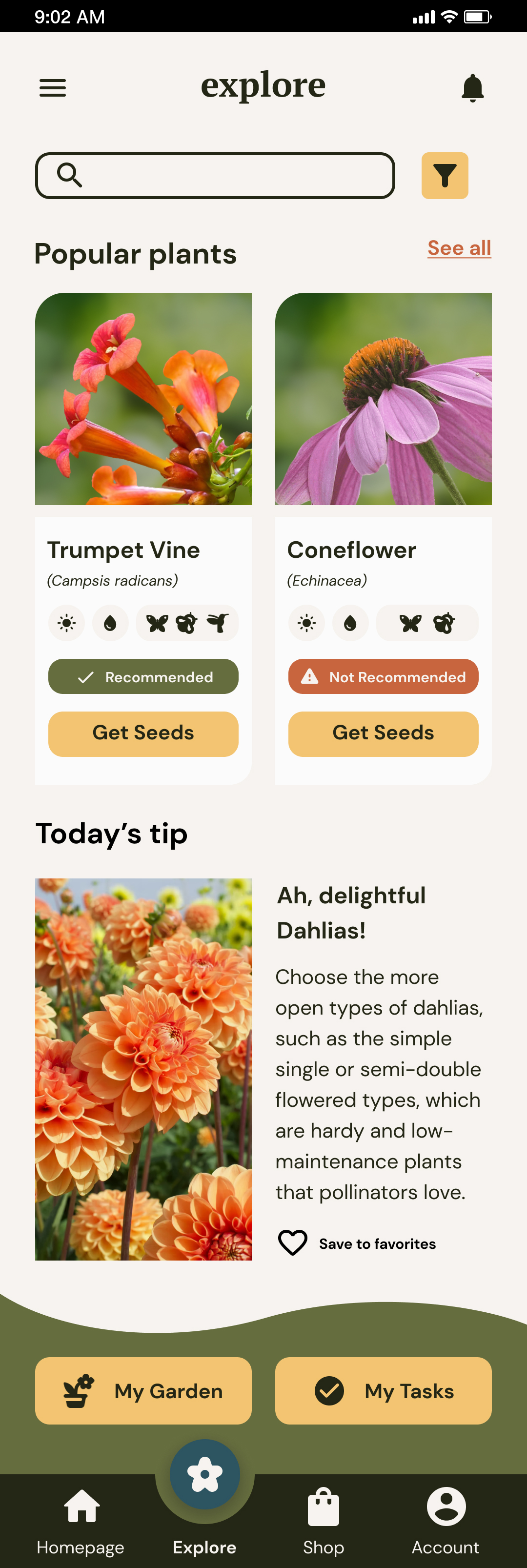
In the Explore section, the users will find three interactive subsections where they will see their tasks, explore tips and popular plants and see their garden.
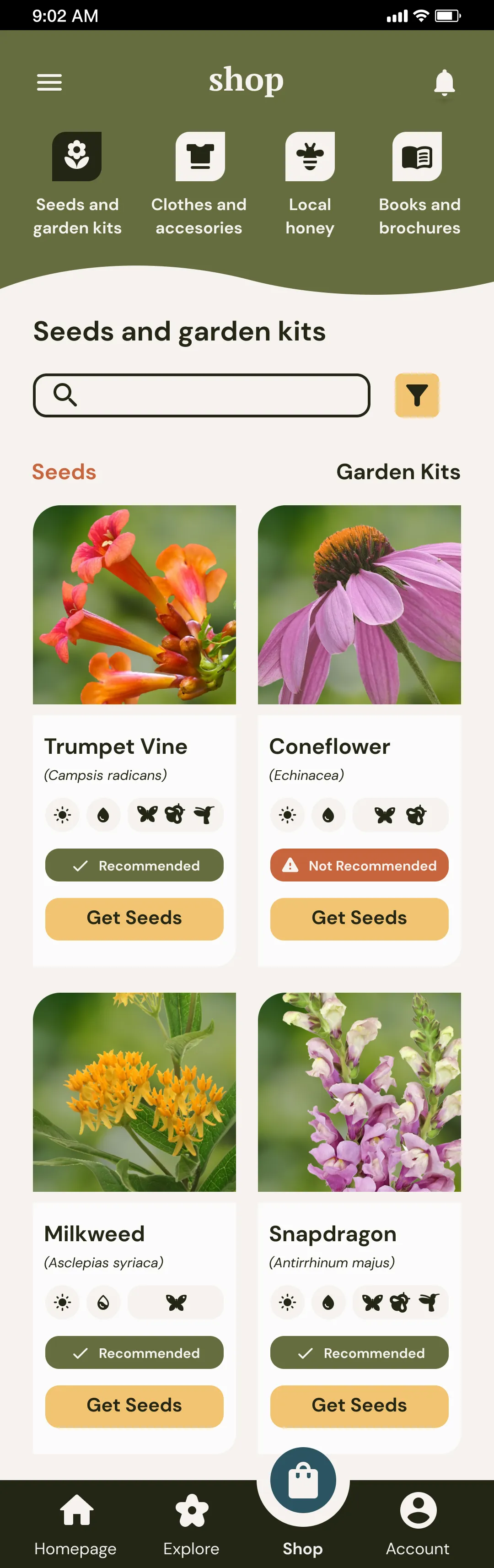
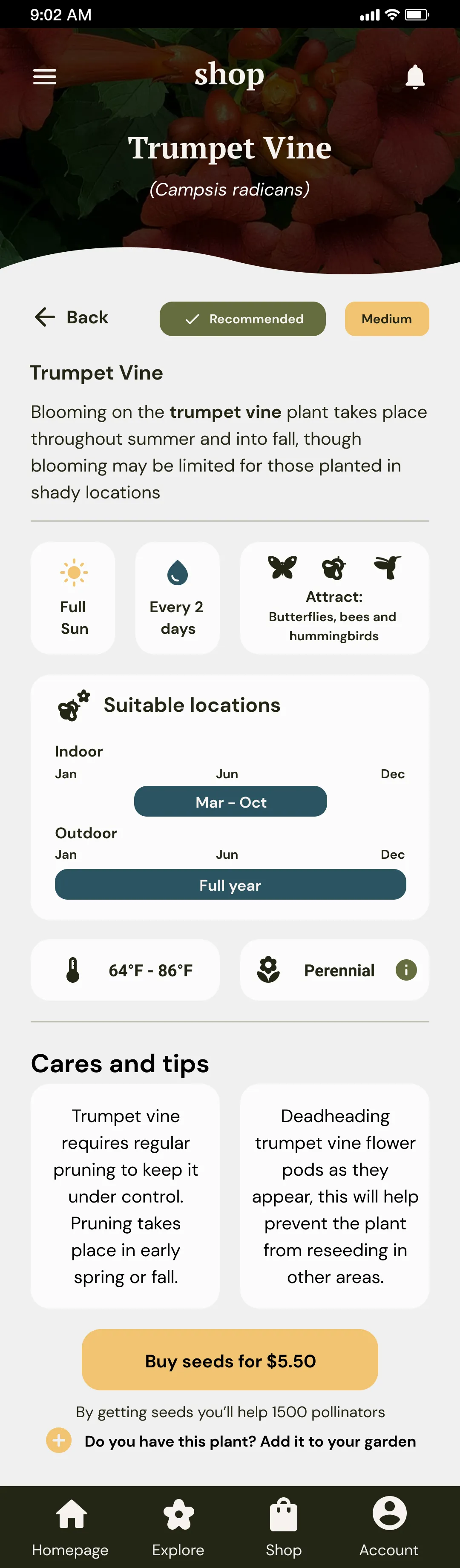
Shop and Plant Information
The users will also have a Shop section. They would find seeds, garden kits, and other items. If they tap on a flower, they’ll get information about it. The users will see if it fits their garden, how difficult it is to take care of the plant, which pollinators will attract, and other tips.
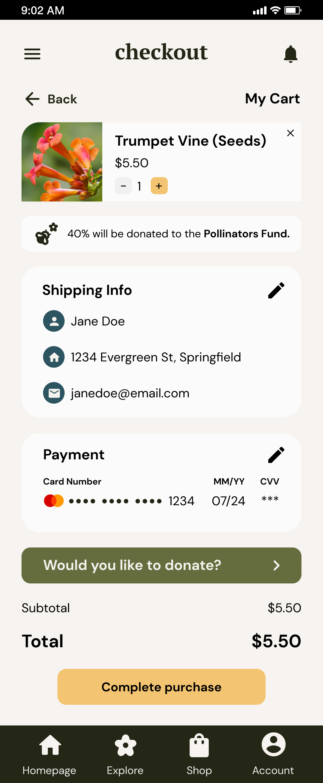
Checkout and complete purchase
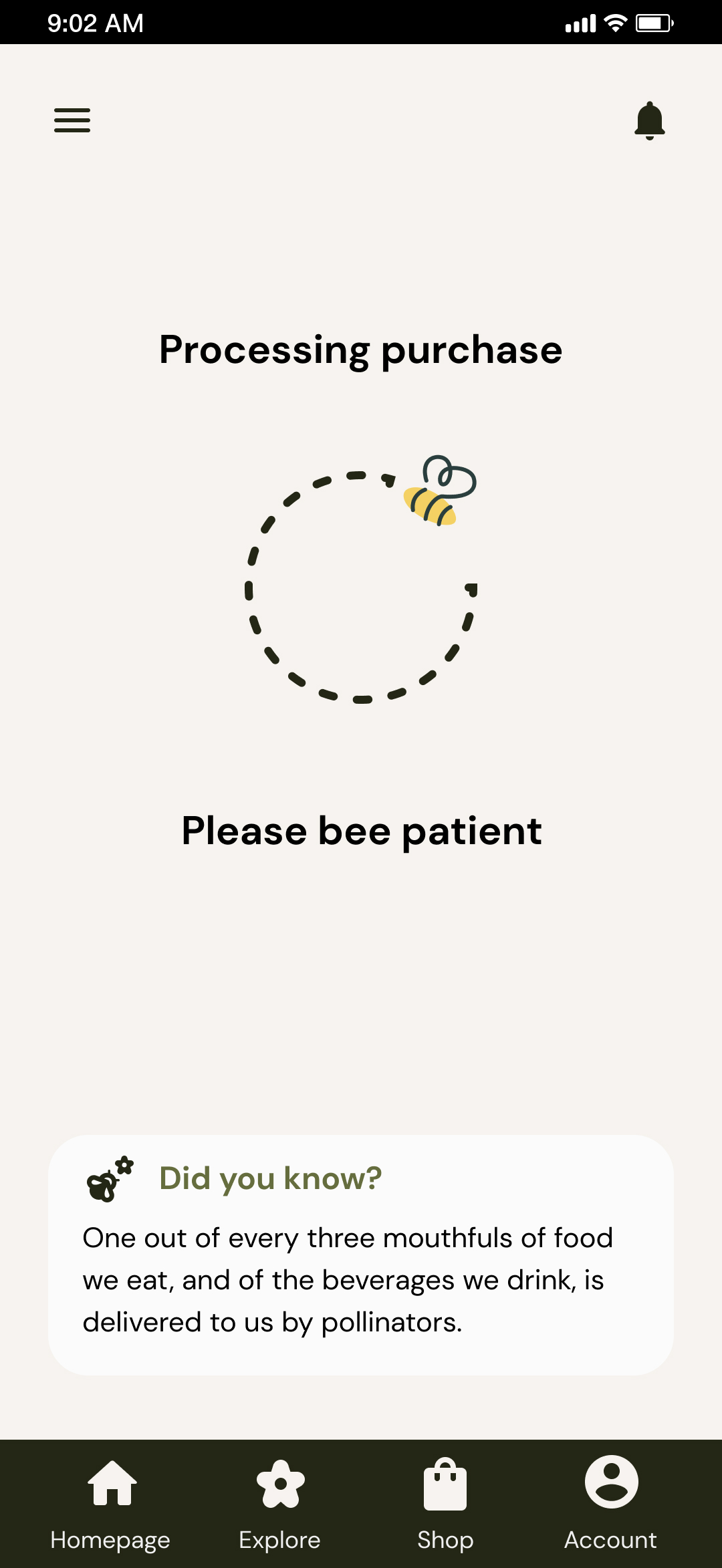
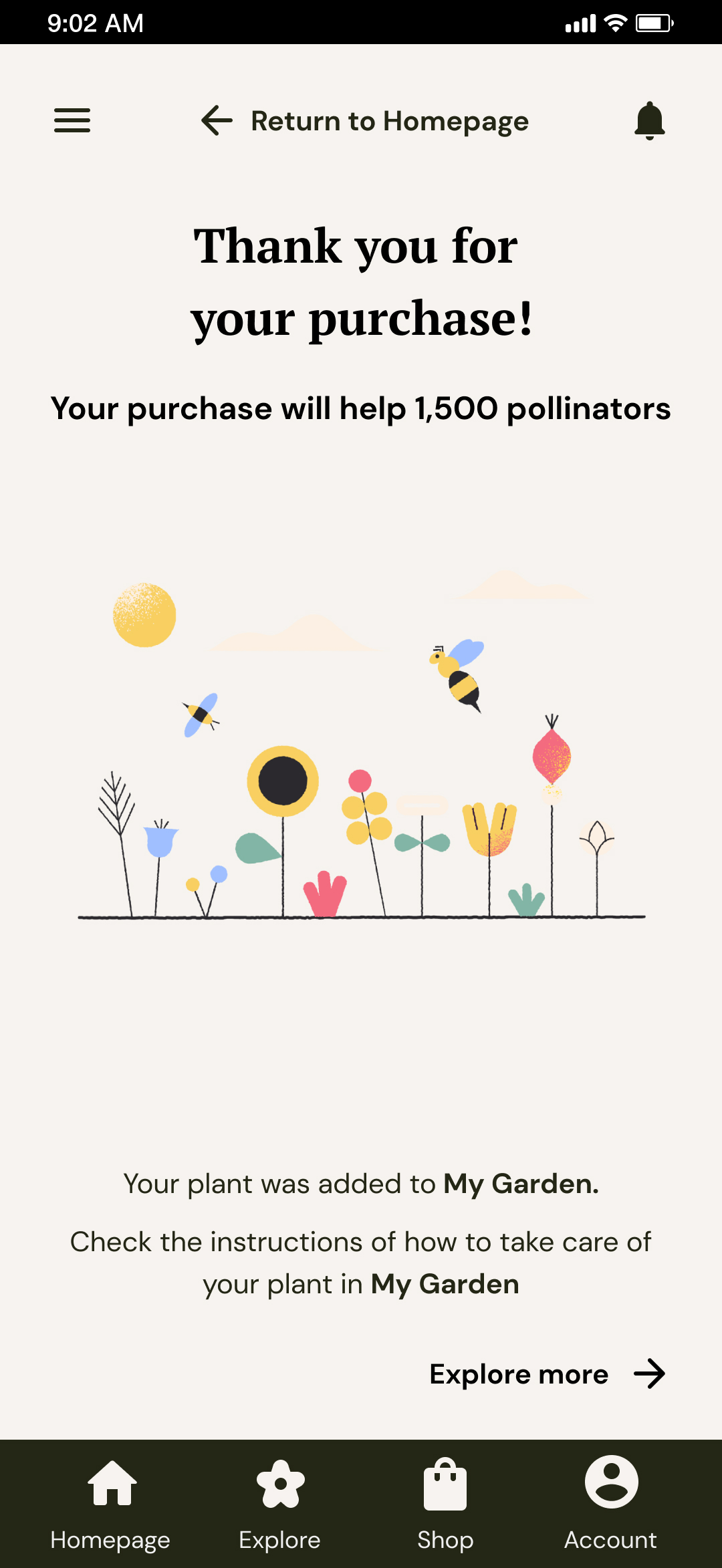
On the checkout wireframe, the users will see the item selected, the users' information, the donation made, and if they would like to donate more. After the purchase, a waiting screen will appear with an interesting fact, then a confirmation wireframe letting them know there will be a new plant in their garden.
Style Guide
01
Color palette
03
Buttons
Accessibility
Responsive design
Information architecture
I created a sitemap for the website based on the findings and the user's needs from the data collected by conducting a competitive audit, user research, and a usability study.
Responsive design
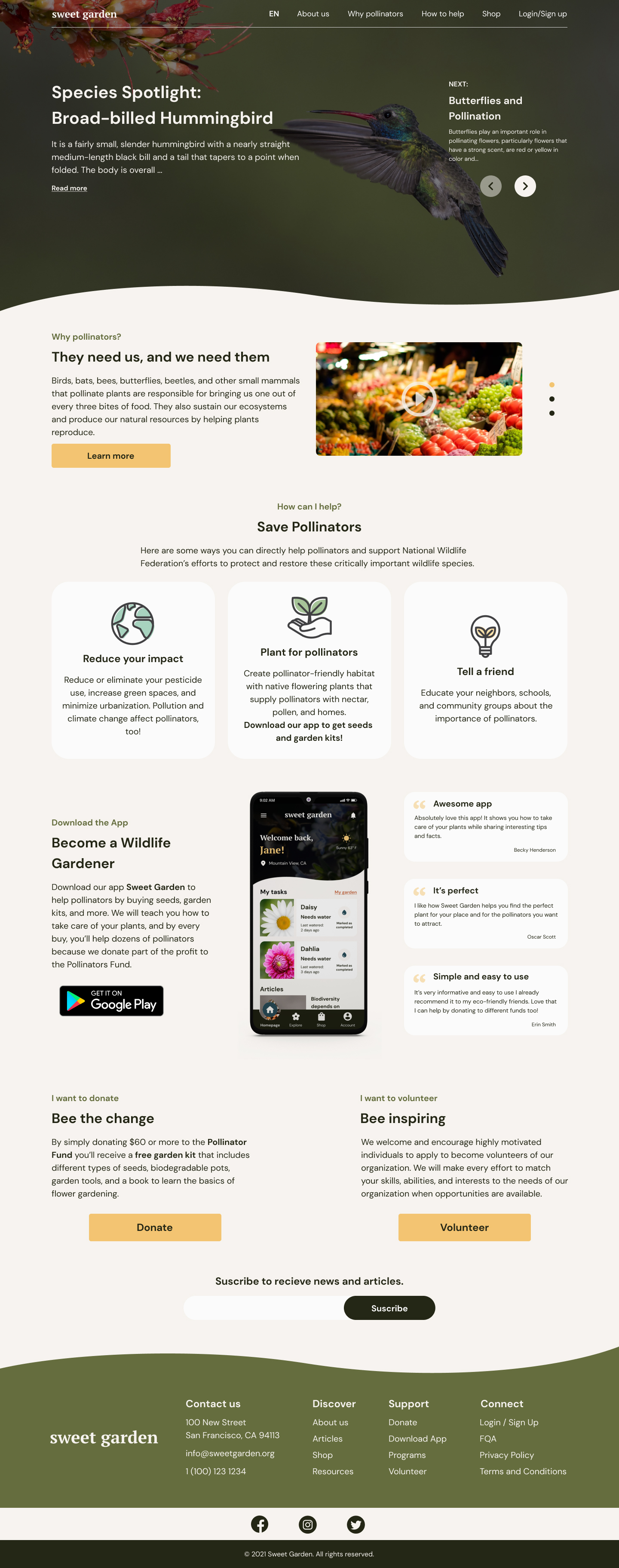
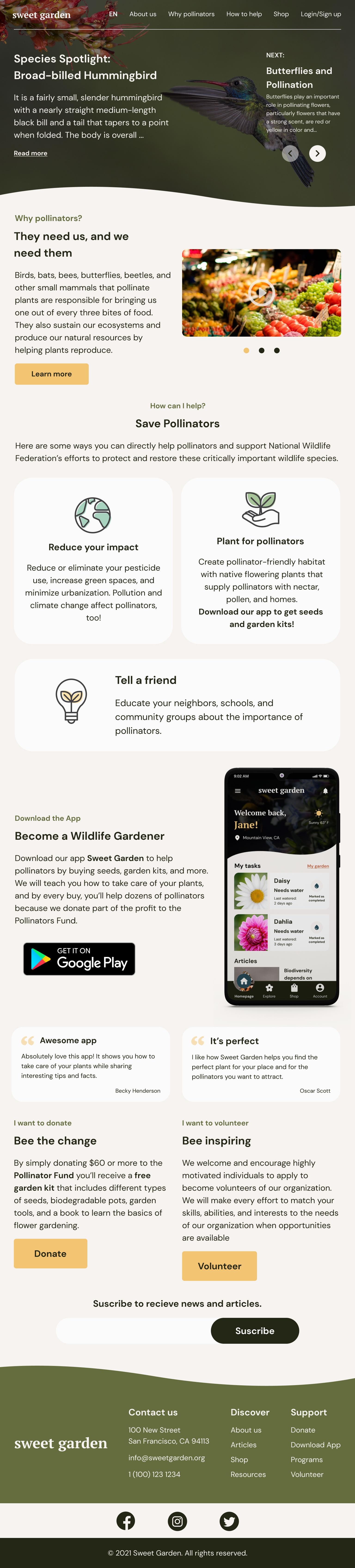
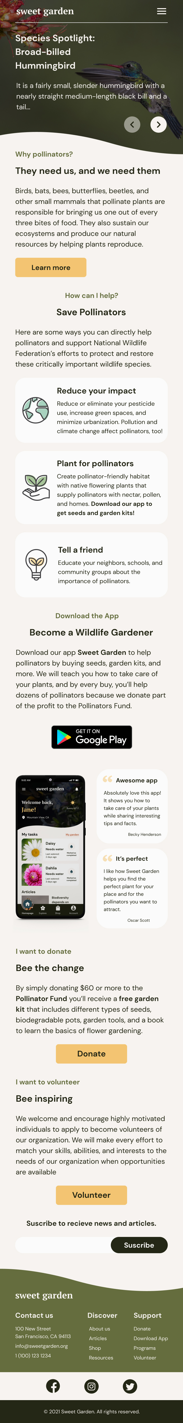
The delivery for this project was a website and an app. I designed it differently. The website, with the purpose of being informative, and the app to be more like a tracker of the plants users may have or want to buy, and a way to keep pollinators coming to their gardens, with interesting articles and different ways to donate to diverse foundations.
Mockups
Homepage responsive website
For the responsive website, I designed three sizes (desktop, iPad, and phone size).
The homepage has information about pollinators, articles, how to save them, a button to download the app, and a subscribe button.
What’s next?
Takeaways


Impact
Even though this project was for a UX Certificate, my goal was to design a tool that people in the real world could be able to use, an easy way for them to get information and learn about how to help this endangered species.


What I learned
The biggest challenge for this project was the user research. Design for a social good is a big responsibility, to think about what the user needs and to try to solve their problem. I learned to design an app and a website separately but with a main goal.
Next steps

Conduct another round of usability studies to learn more about what users think about the Hi-Fi Prototype from the app.
Learn from the findings of usability studies and improve the design

Finish the design of the responsive website and conduct a usability study.