Design process
Design thinking

Empathize
Find what users need and learn how to think and feel like them.
- UX research
- User interviews

Define
Define the challenge based on the information gathered about the users.
- User persona
- Competitive audit

Ideate
Brainstorm focusing on the quantity of the ideas more than the quality to come up with the ideal solutions.

Prototype
A scaled-down version of a product that shows essential functions.
- Wireframes
- Lo-Fi Prototype
- Mockups
- Hi-Fi Prototype

Test
Test the prototype with users.
Understanding the user
User research

I conducted user research with people who go to the movie theater often. Most of them said they prefer to get their tickets at the cinemas because they’re afraid of not having their seats secured if they make the reservation online.

Before the user research, I thought users would say they don’t like trailers/ads before the movies (I thought of adding an option for a notification to skip them), but surprisingly they like it. That finding cleared my view, and I didn’t have to add anything to that assumption and could focus on other features.
Pain points
User Interface
Users said movie theater websites are always too crowded, not easy to follow, and sometimes very slow.

“I rather go to the movie theater than buy tickets online because their websites are always too slow”
Trust in seat reservation
Users usually prefer to go directly to the movie theater to buy tickets because they don’t trust “seat reservations.”

“I’m afraid of going to the cinema and when entering the room someone is sitting in my ‘reserved’ seat”
Lines at movie theaters
Users said they would like an option to order snacks ahead and skip the line at the concession.
"I love popcorn but I hate to wait in line”
Accessibility
Not all movie theater websites have accessibility options (for their websites and their movie auditoriums).
User persona
After analyzing the user research data, I created a user persona that helps understand the user’s needs, behavior, demographic, goals, and frustrations. This fictional character summarizes and communicates the data collected in the research in a more accessible way and allows me to design the project having the user in mind.

Alex
“I’m the type of person who eats all the popcorn while they're still going through the trailers”
Demographic
Age: 29
Location: San Francisco, CA
Education: Bachelor’s Degree
Job: Creative Content Coordinator
Brief
Alex is a 29-year-old man who goes to the movies couple of times a month. He prefers to buy tickets directly at the cinema because he feels safer he only uses the website on premiers but gets frustrated when it gets slow and prices change. He likes to arrive early and see the trailers and ads before the movie because it inspires him. He loves to get popcorn and other snacks, but he don’t like the line at the concession stand.
Goals
- To find a safe way to reserve my seats.
- To have the power to skip the line at the concession stand.
- Get a better way to see reviews.
Frustrations
- Lines at the concession stand
- Websites are slow, and prices change.
- The filling information process (payment cards, loyalty cards).
Journey map
This journey map helped me to understand how the user would feel when trying to accomplish his goals. These goals are picking a movie, reserving seats, and getting tickets online.
Starting the design
Sitemap
I constructed a sitemap based on the pain points from the data collected on the competitive audit and the user research. This sitemap will represent how the navigation will be on the website.
Paper wireframes
Refining the design
Digital wireframes
Responsive Lo-Fi Wireframes (desktop and mobile)


Usability study
I conducted a usability study with four participants that go to the cinema often. The goal was to learn how the users reserve seats and get tickets from a movie theater website.

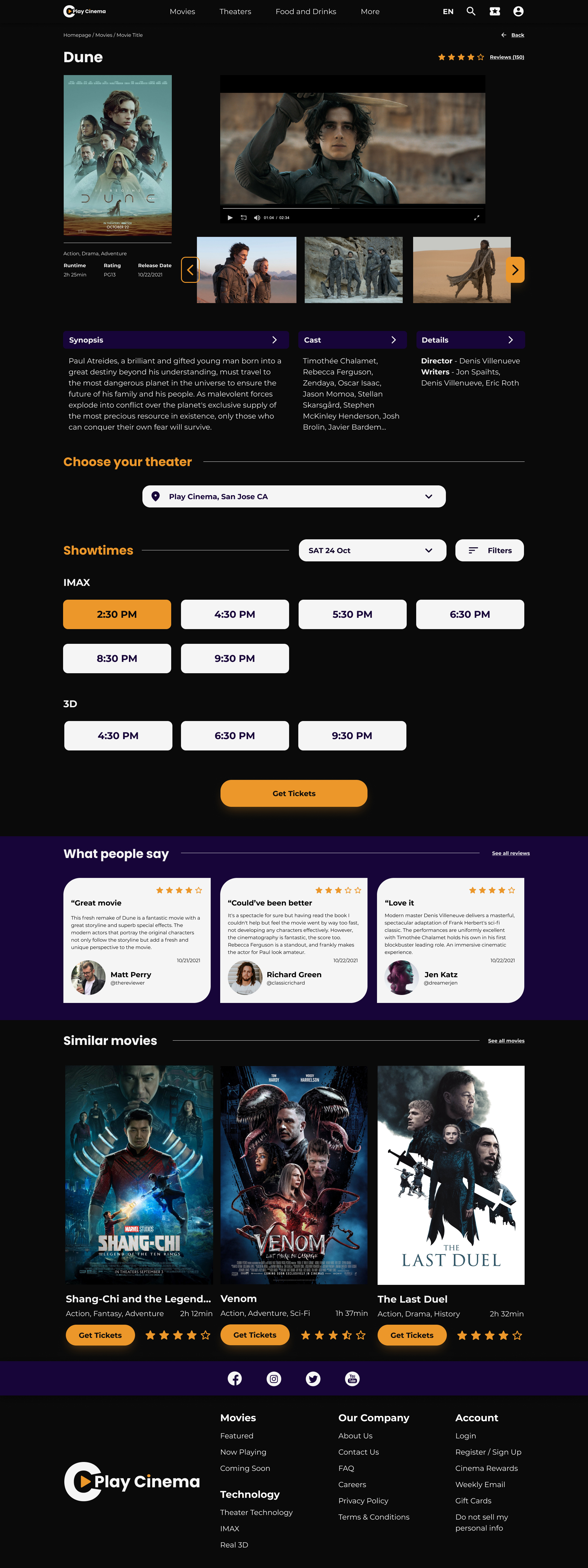
Users were frustrated that they had to click "get tickets" to see the hours of the showtime, so I changed it and added the hours and the cinema available on the movie information page.

Users asked for more filter options.

Some users didn’t notice they could add snacks with the purchase because it was at the bottom part.
Lo-Fi Wireframes after usability study

Mockups
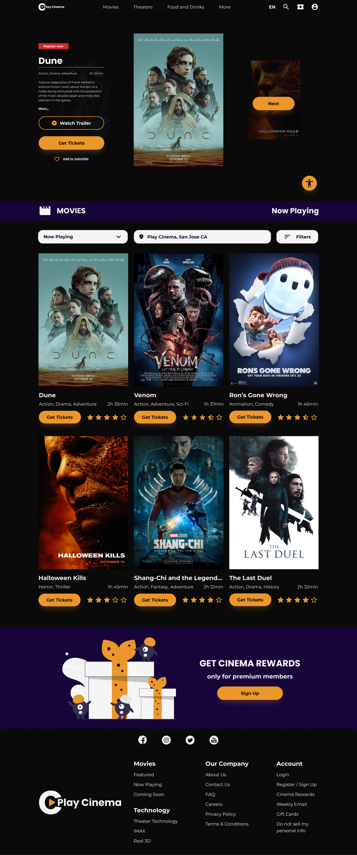
Homepage and movie information page
On the homepage, there's a carousel that will show the newest and the most popular movies at the cinema. When scrolling down it shows the movie theater locations and the filters to search movies. The homepage also includes an accessibility button so users can be able to change the settings of the page.
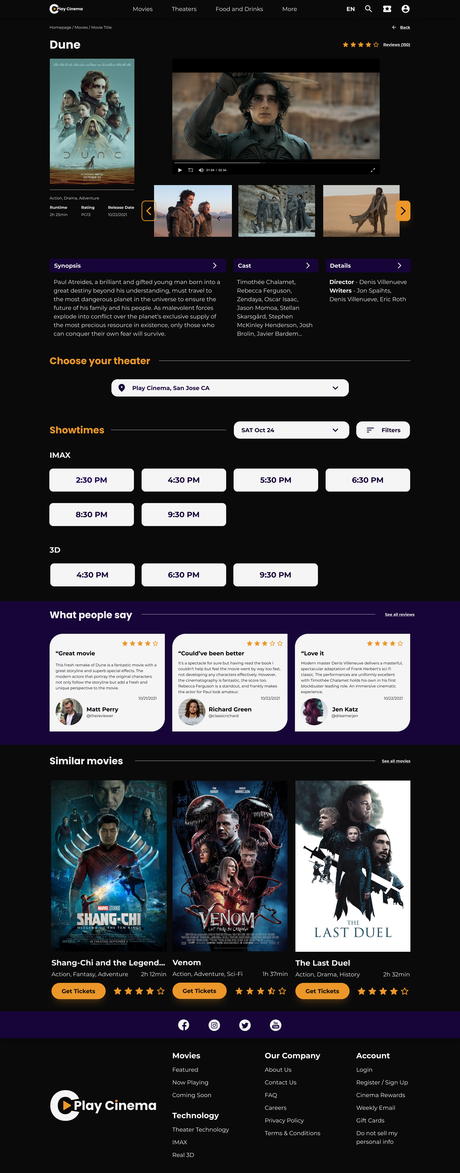
After selecting the movie, it will redirect to the movie page that shows the days and hours of showtime. The user would be able to also see the trailers, the movie details, pictures, the reviews from users, and other similar movies.
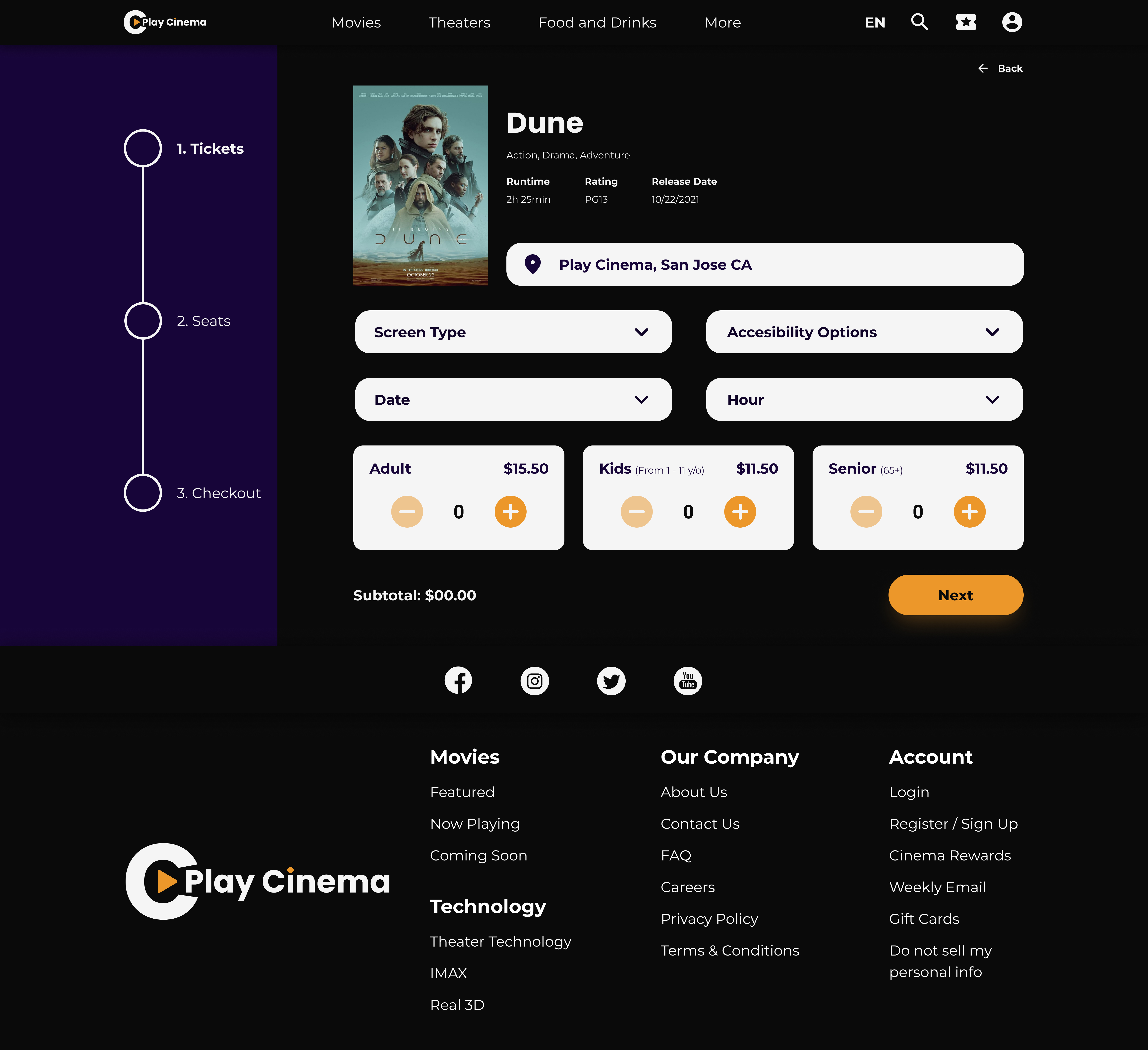
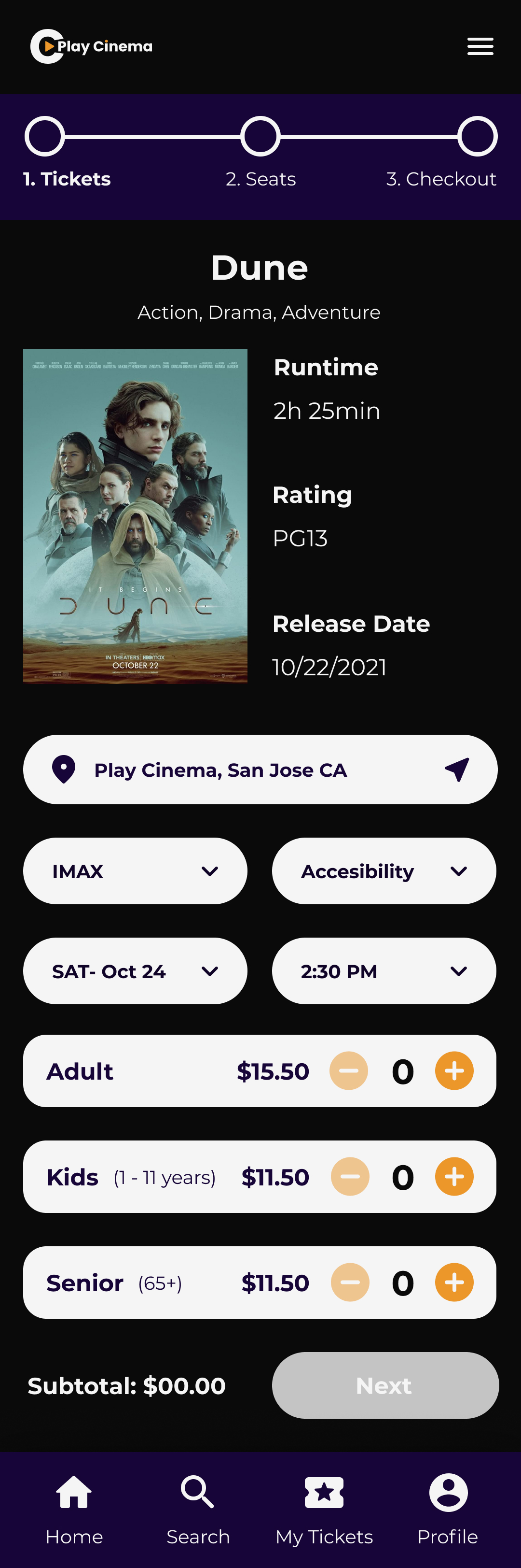
Ticket options responsive page
Ticket options page, where the user can choose the screen type, accessibility options and the amount of tickets. The user can also get to this page if it selects the “Get ticket” button on each movie on the homepage.
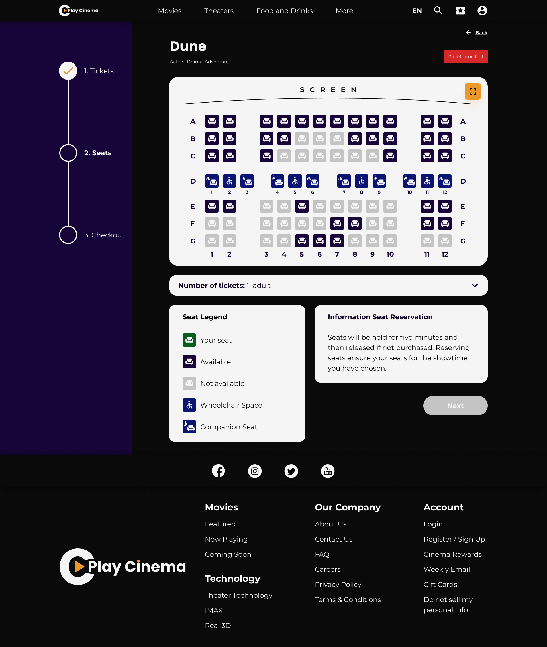
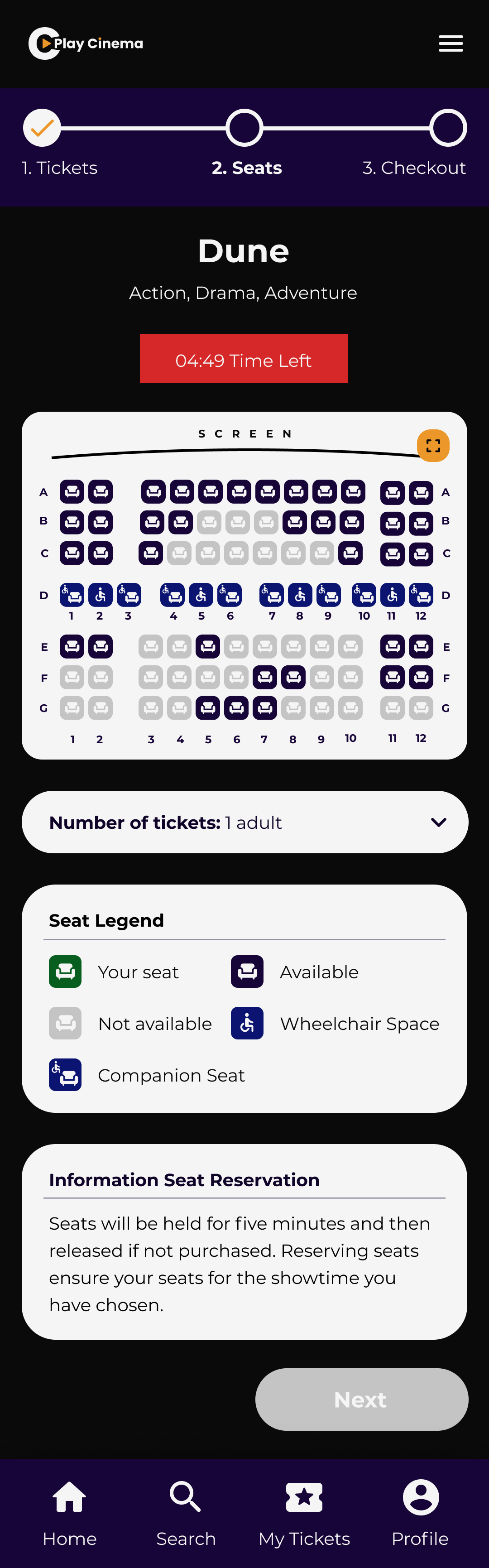
Seat selection responsive page
The users will have the option to reserve their seats with an interactive map. It includes a box with the information of seat reservation that says it will be held for five minutes so the user would feel secure about their selected seats.
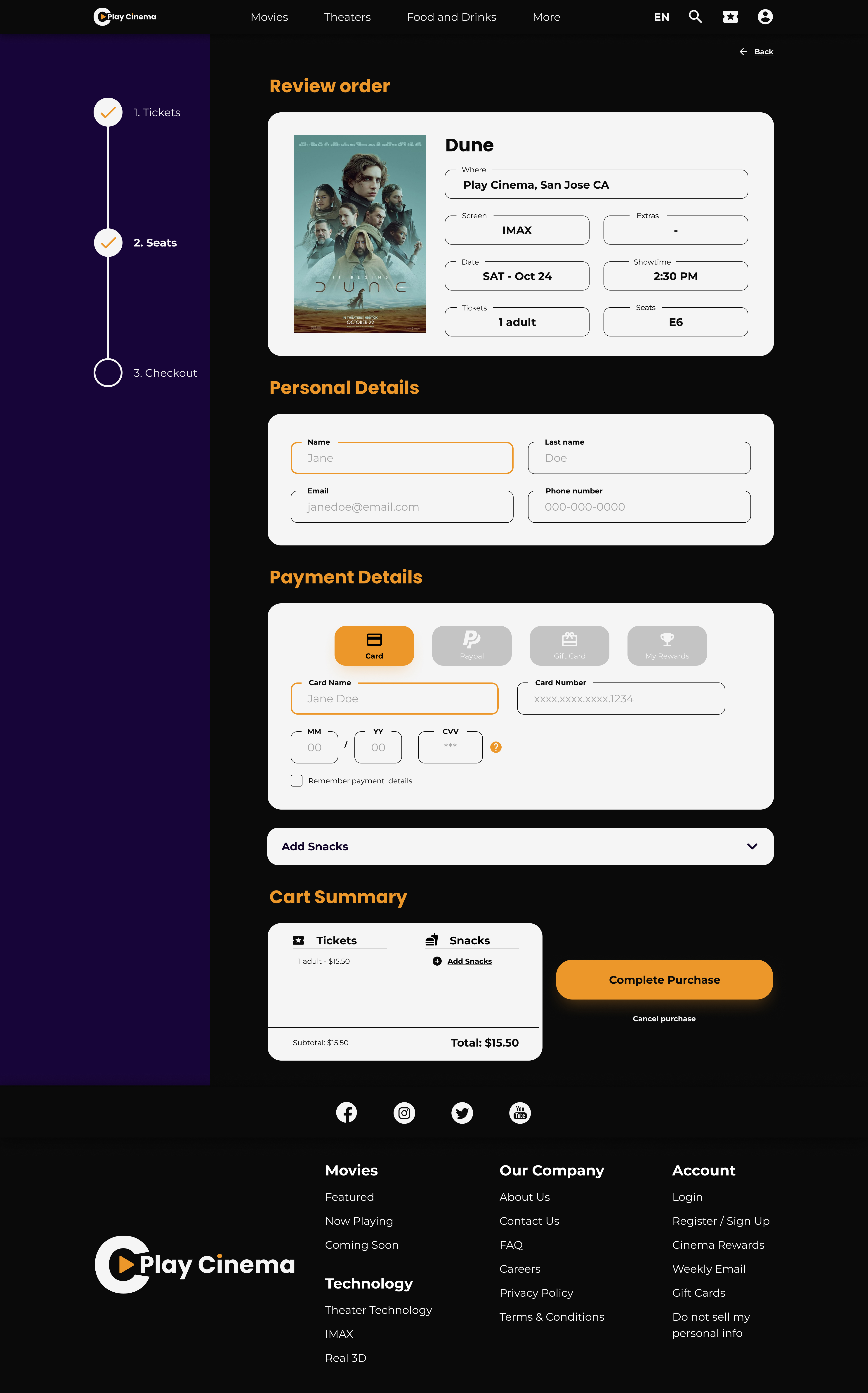
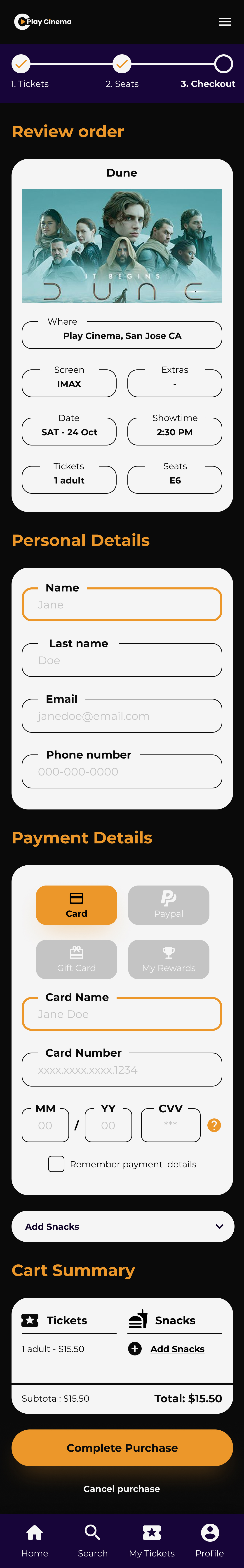
Checkout responsive page
The checkout page will show the order review, the inputs to fill in the personal and payment details, and a category for snacks.
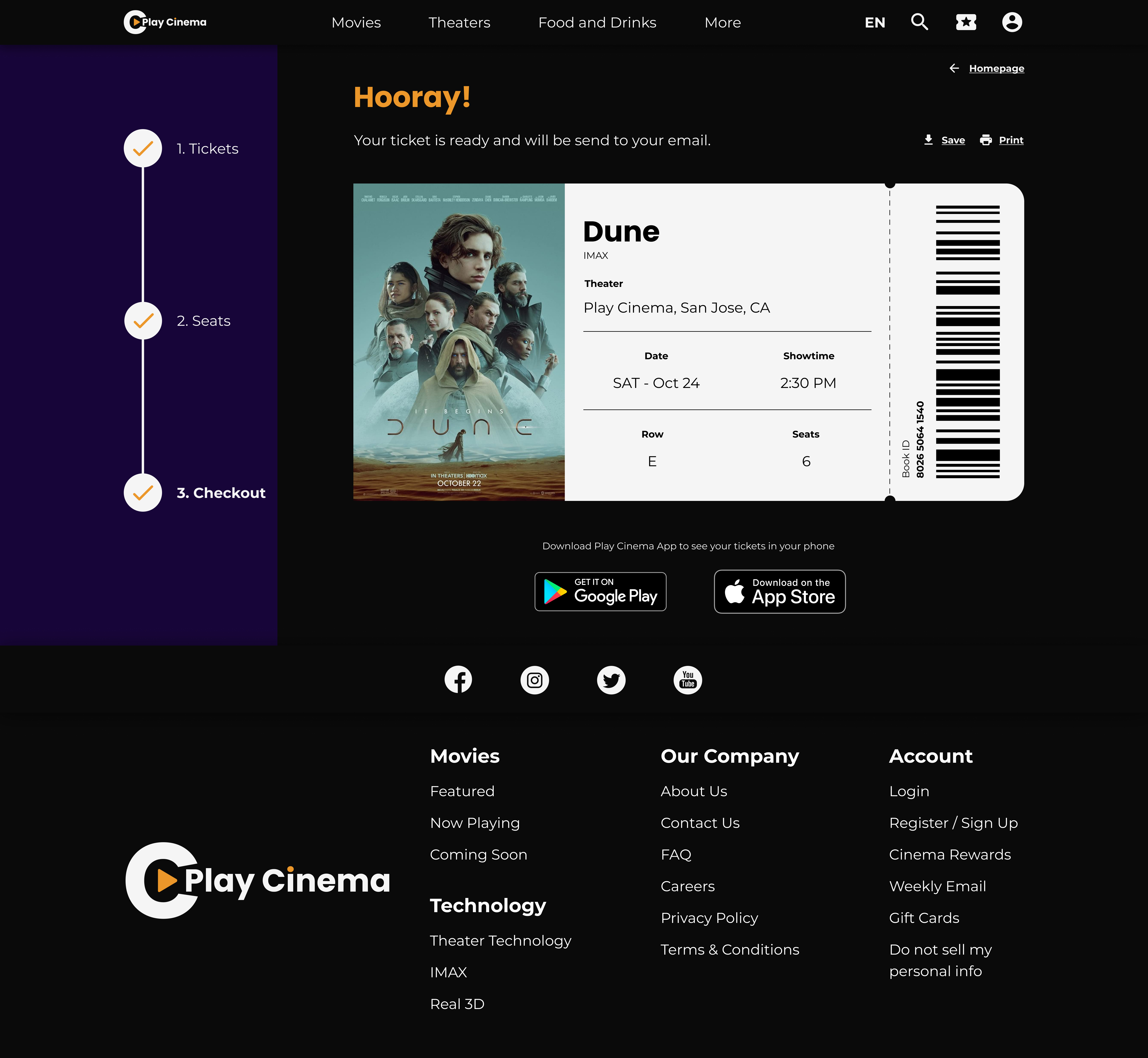
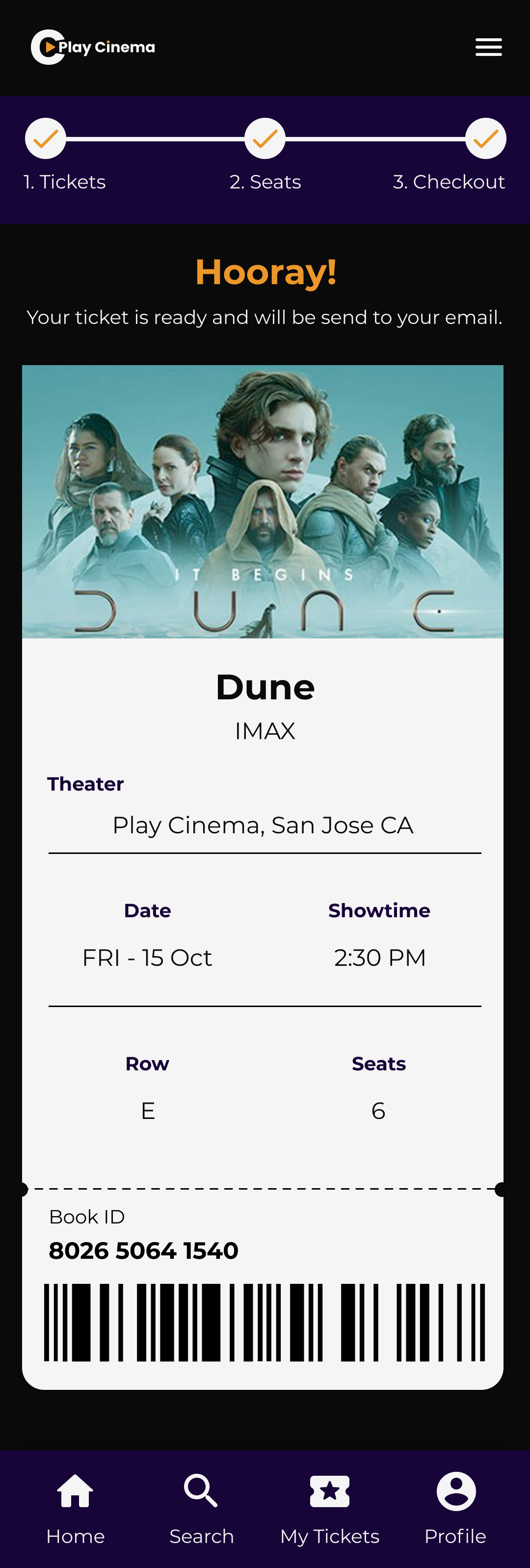
Complete purchase responsive page
After completing the purchase, it will show the ticket with all the details and a barcode to skip the line at the cinemas.
Style Guide
01
Logo
03
Color palette
Original color palette idea

Color blind check

05
Icons
Accessibility
What’s next?
Takeaways

Impact
My goal was to design a website that could be used by everyone. A responsive, user-friendly website, accessible, with a clear flow, and could be easy and secure to get tickets.
On the review of the Hi-Fi Prototype, this is one of the positive comments I got from a colleague on the certificate:

This was really great use of the visual and technical elements. Great work!”

What I learned
My biggest challenge and the most important thing I learned was to create a responsive website. I’ve designed websites and mobile apps separately but creating a website and their mobile version (responsive) was challenging. Creating a similar design but carefully placing the elements and not to lose the main design was interesting.
The course reminded me to consider accessibility, to be aware of biases, learn how to overcome them, and think like the user-building problem and goal statements.And last but not least, to learn how to give and take feedback.
Next steps

Conduct another round of usability studies to learn more about what users think about the Hi-Fi Prototype.
Learn from the findings from usability studies and improve the design.