Design process
Design thinking

Empathize
Find what users need and learn how to think and feel like them.
- UX research
- User interviews

Define
Define the challenge based on the information gathered about the users.
- User persona
- Competitive audit

Ideate
Brainstorm focusing on the quantity of the ideas more than the quality to come up with the ideal solutions.

Prototype
A scaled-down version of a product that shows essential functions.
- Wireframes
- Lo-Fi Prototype
- Mockups
- Hi-Fi Prototype

Test
Test the prototype with users.
Understanding the user
User research

Based on the project background, the user research goal was to learn the normal ordering process of busy users and to see if they would use the new features and how useful they think it is. I conducted an unmoderated usability study with participants who are full-time workers and usually order coffee from mobile apps at least twice a week.
Pain points
When creating the portfolio, I realized I didn't understand this part of the project. I thought the pain points had to be from the app and not about the situation. I considered changing this information to the correct one, but I decided to leave it to see my progress in learning UX.
Location feature
Users felt the location feature was confusing. Initially, they thought it was a status bar of the order.

"Why it says ‘pickup order’ here if I haven't ordered anything yet?"
Favorite button
Users liked the favorite button. But they were confused because there wasn't a favorite category.

"If I tap on the star, where does it go?"
Customization
Users find it stressful that the Lo-Fi prototype didn’t have a screen where they could customize their items.
“I’d like to see the options on ‘customize drink’, I want to make sure they have the type of milk and sweetener I like...”
Language options
Users need an option to change the language for those who aren’t English speakers.
"Can I change the language? Maybe is easier for me to understand if it's in my native language."
User persona
After analyzing the user research data, I created a user persona that helps understand the user’s needs, behavior, demographic, goals, and frustrations. This fictional character summarizes and communicates the data collected in the research in a more accessible way and allows me to design the project having the user in mind.

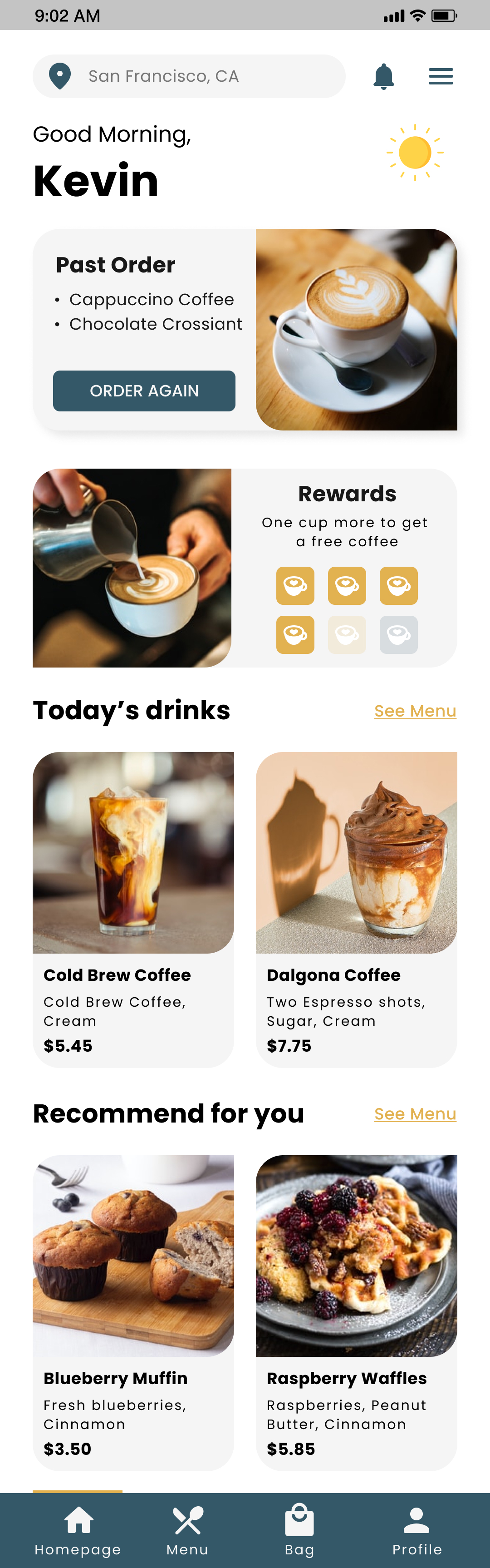
Kevin
“Coffee gives me unrealistic expectations of productivity”
Demographic
Age: 35
Location: San Francisco, CA
Education: M.Sc. Software Engineer
Job: Senior Software Engineer at a big company
Brief
Kevin is a 30-year-old engineer. He likes to go for a coffee before he go to work, but gets frustrated when the lines are long and he arrives late to work. Coffee is crucial to him because it’s the motivation for his productivity. When he orders online, he doesn’t like to specify his order every time because it’s a waste of time.
Goals
- Arrive early at work.
- Have more hours of productivity and less procrastination.
- Get along with other teams.
Frustrations
- “I like to go for coffee before work but sometimes the lines take too long”
- “I like to order coffee in apps but I don’t like to personalize my order every time, it takes me a lot of time.”
Journey Map
This journey map helped me to understand how the user would feel when he’s trying to accomplish his goal, which is getting a coffee without spending too much time in line or while he’s navigating the app.
Competitive audit
It's essential to research similar products/projects that already exist to examine their interactions, visual design, information architecture, and content. After research, I analyzed the data collected to understand some of the pain points of other similar projects, consider them, and improve mine, so it stands out from the rest.
The projects I looked into to create the competitive audit:

Starbucks
First impressions
On the desktop, the first impression was good, with engaging animations and easy to navigate. Prices are not showing, and I couldn’t make an order without an account. The mobile app has smooth interaction and reward options, but the payment method is confusing.
Interaction
Starbucks app and its website have a good user flow and navigation, with engaging images and buttons, and the reward feature, which could be very attractive to users. The website has good accessibility options. It has good-quality pictures and keyboard friendly, but the menu is only available in English.
Visual design
The visual design from Starbucks is outstanding. It had a strong brand identity, a consistent color palette, and recognizable imagery and photography.
Content
Both website and app have a good balance between the information and the visuals, with a friendly tone and descriptiveness that is short to the point.

Dear Diary
First impressions
Dear Diary, a vegan coffee house with no app but a responsive website. Easy to navigate, clean design. The order page redirects to another page, and the menu has no pictures.
Interaction
The website is easy and fun to navigate, with engaging animations. The user flow is clear, but once you’re ordering, there’s no direct way back to the homepage. There are no engaging features and need improvement with accessibility.
Visual design
The visual design is very appealing. It has a consistent color palette and typography. Minimalist and clean.
Content
The website has a good balance between the information and the visuals.

Peet's Coffee
First impressions
The website and the app were very welcoming, easy to use and order, with a clean design, but on the website, there’s too much information it can be overwhelming sometimes. You can discover a secret menu on the app, but you can’t order without an account.
Interaction
The website and app are easy to navigate with a clear indication on ordering and customize, but the user flow could be confusing once you're ordering. Peet’s Coffee’s features are outstanding, with a coffee match quiz, a secret menu, and a rewards feature. Peet’s Coffee needs to improve in accessibility (not keyboard-friendly).
Visual design
Peet’s Coffee has a good visual design. It has a clear design, with a consistent color palette and recognizable imagery and photography, but some font sizes are too small or too big.
Content
Good balance between visuals and text, with a friendly and direct tone.

Andytown Coffee Roasters
First impressions
Andytown Coffee doesn't have a mobile app but has a responsive website. The homepage is not very visually appealing because it’s too simple but to the point. The website is easy to use, but the text sometimes is too small.
Interaction
The website is easy to navigate, but it has no hierarchy, and sometimes is hard to find information. There are no interesting features it doesn’t have delivery options. It needs improvement for accessibility (menu not keyboard friendly, website only in English, and not compatible with a screen reader).
Visual design
Even though the homepage is simple, it needs improvement. There’s no hierarchy, the contrast between text and images makes it hard to read, and the font size sometimes is too small.
Content
The website has a good balance between visuals and text. Serious tone but is direct to the point.
Starting the design
Ideation Process
Crazy Eight
For my ideation process, I used the Crazy Eight method, which is a fast sketching brainstorming exercise where I sketched eight different designs, for the website and the app, in eight minutes.
Then I selected the designs I liked the most and what I thought would be better for the users.
Storyboard - Close up
I also designed two storyboards, one in “close-up” and the other one as “big picture.” This helped me to have a better view of how the user would use the app on an average day.
Paper wireframes
Refining the design
Digital wireframes
Based on the results from the usability study, I re-designed the digital wireframes to adjust to the users’ needs. The most requested feature was the “Favorite” category, where users could save their most liked and custom items. Users also asked for a status bar where they could see the progress of their order.
Lo-Fi Wireframes

Usability study
Based on the results from the usability study, I re-designed the digital wireframes to adjust to the users’ needs. The most requested feature was the “Favorite” category, where users could save their most liked and custom items. Users also asked for a status bar where they could see the progress of their order.

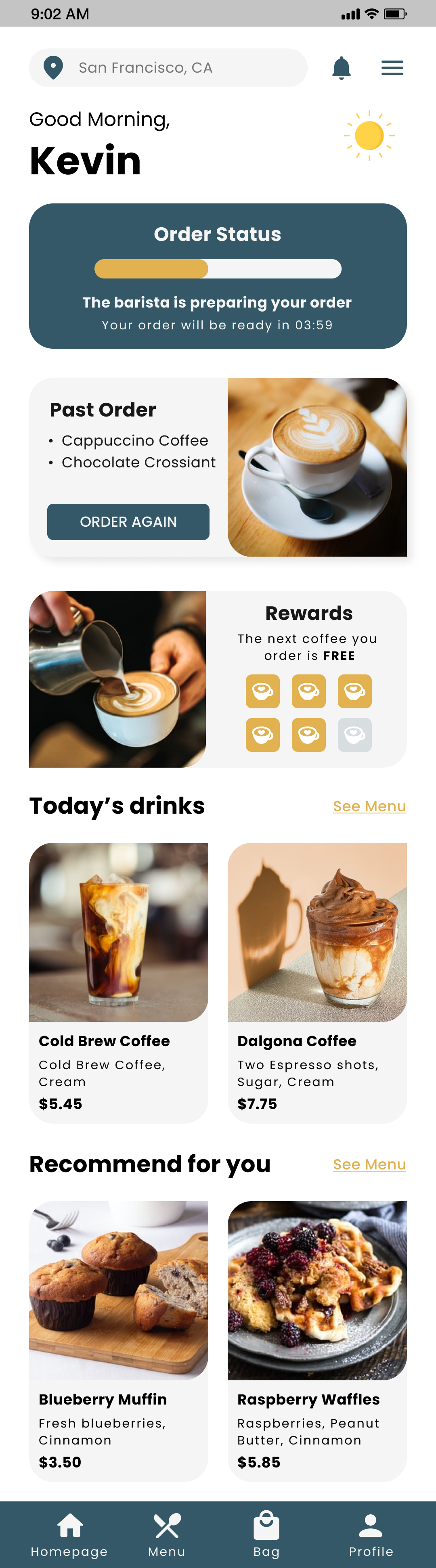
Users said the location feature was unnecessary and confusing, They wanted to change it to an order status bar.

Users asked for more customizing options and a favorite category to save items.
Lo-Fi Wireframes after usability study

Mockups
Hi-Fi is finally ready to use! Here are some pictures of the mockups from the COCO Cafe app.
Homepage
The users will find a section that shows their past orders on the homepage, which makes the checkout process faster. If users return to the homepage after checkout, it will show a bar with their order status.
The homepage will also show their rewards, today’s drinks, and recommended picks for them.
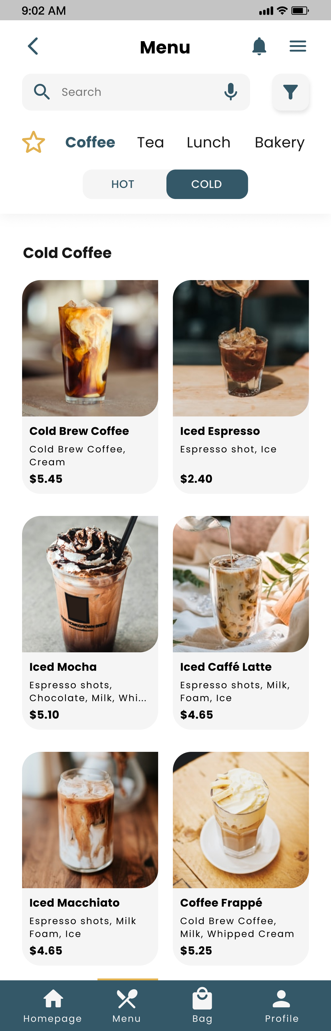
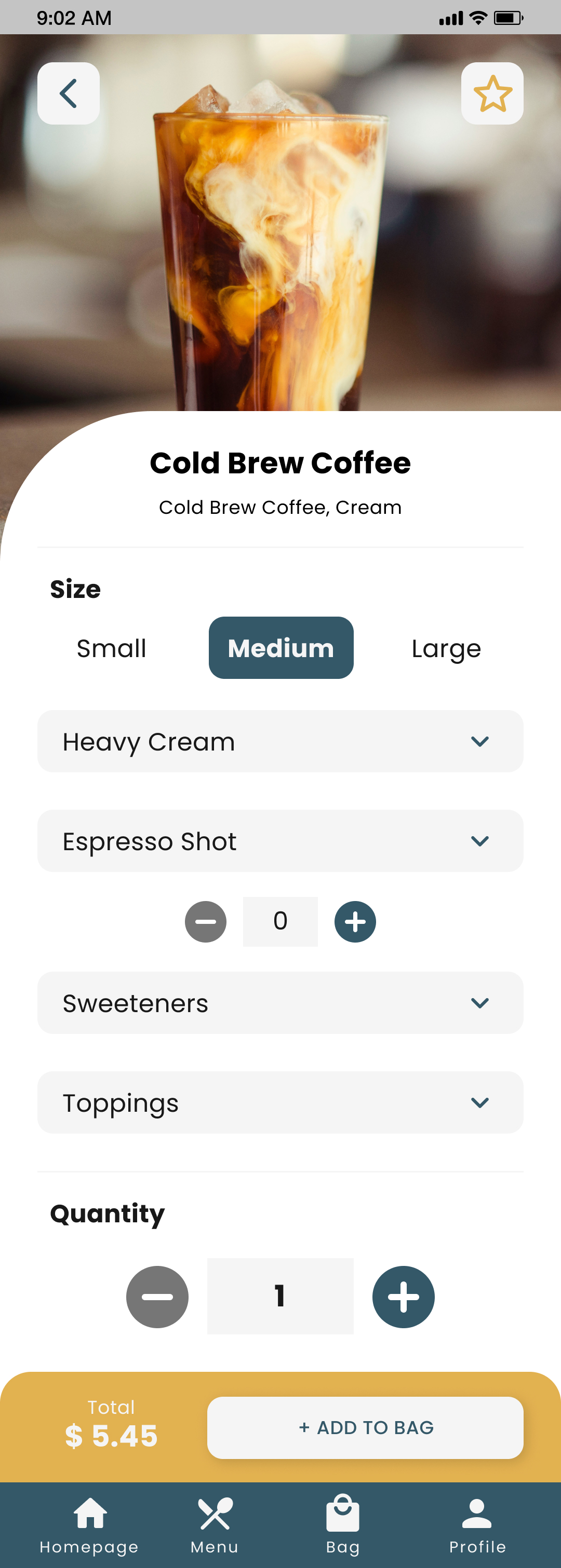
Menu Food information
The menu wireframe shows the food from COCO Cafe. It also has a favorite category where users can save their favorite items. When users select an item, they will be able to personalize it.
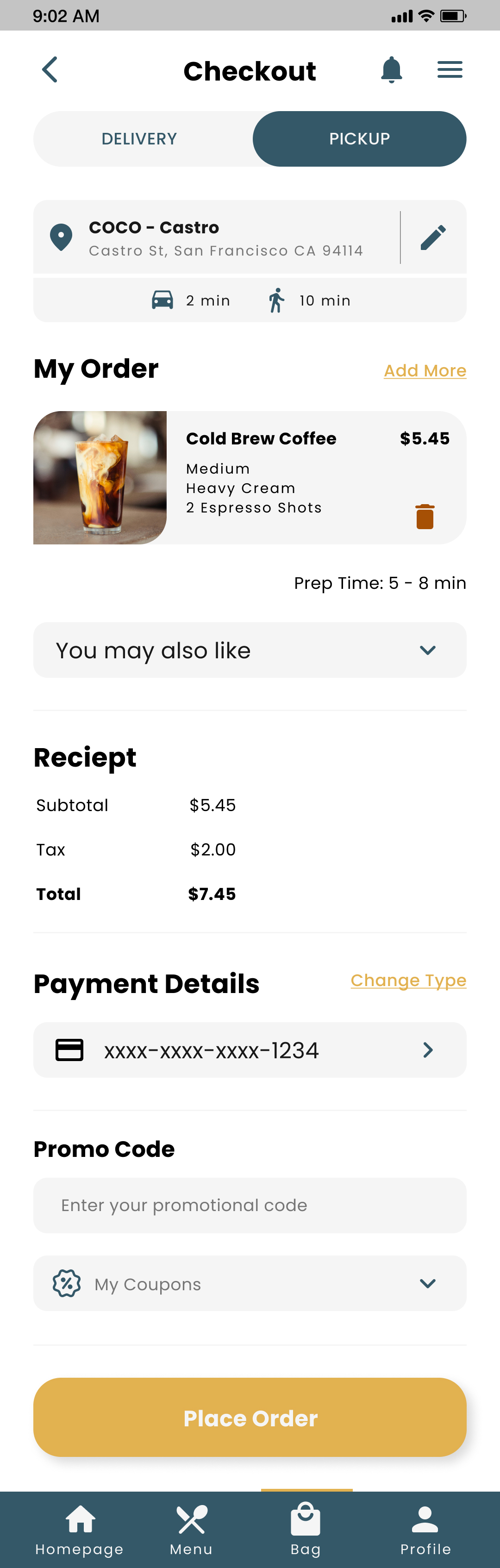
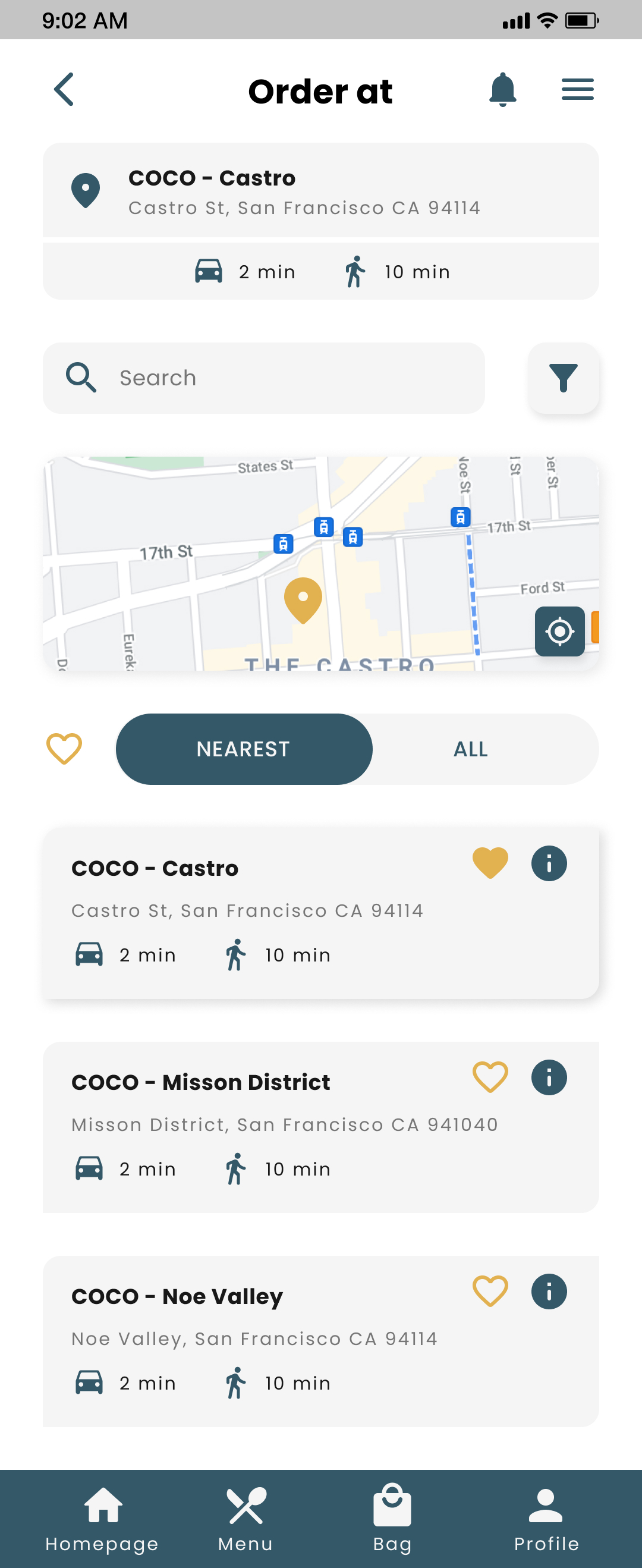
Checkout and Locations
Users will find their order with the option to deliver or pickup on the checkout wireframe. They will also see the payment details and a promo code section.
If users want to change locations, they’ll see a wireframe that shows them the closest coffee house with more information and an option to save their favorites.
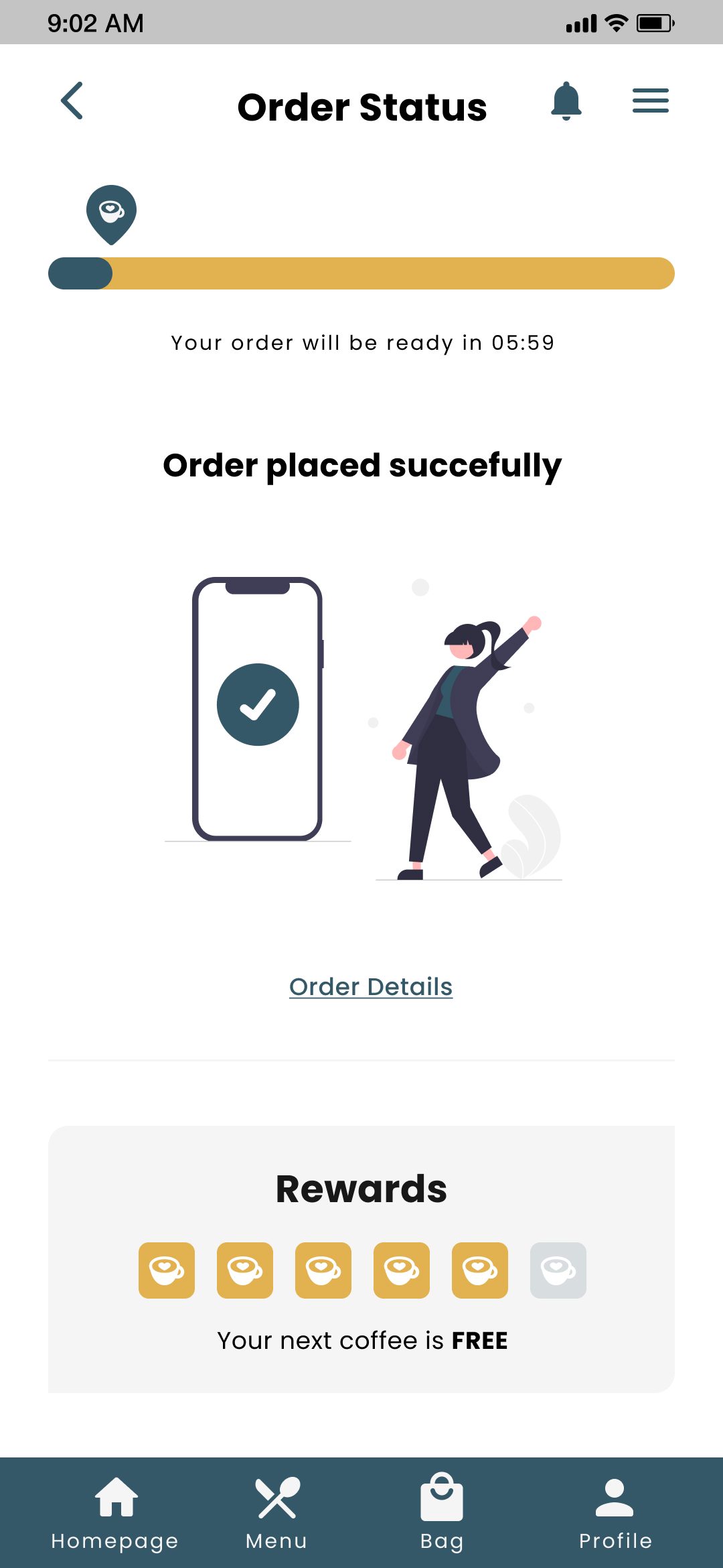
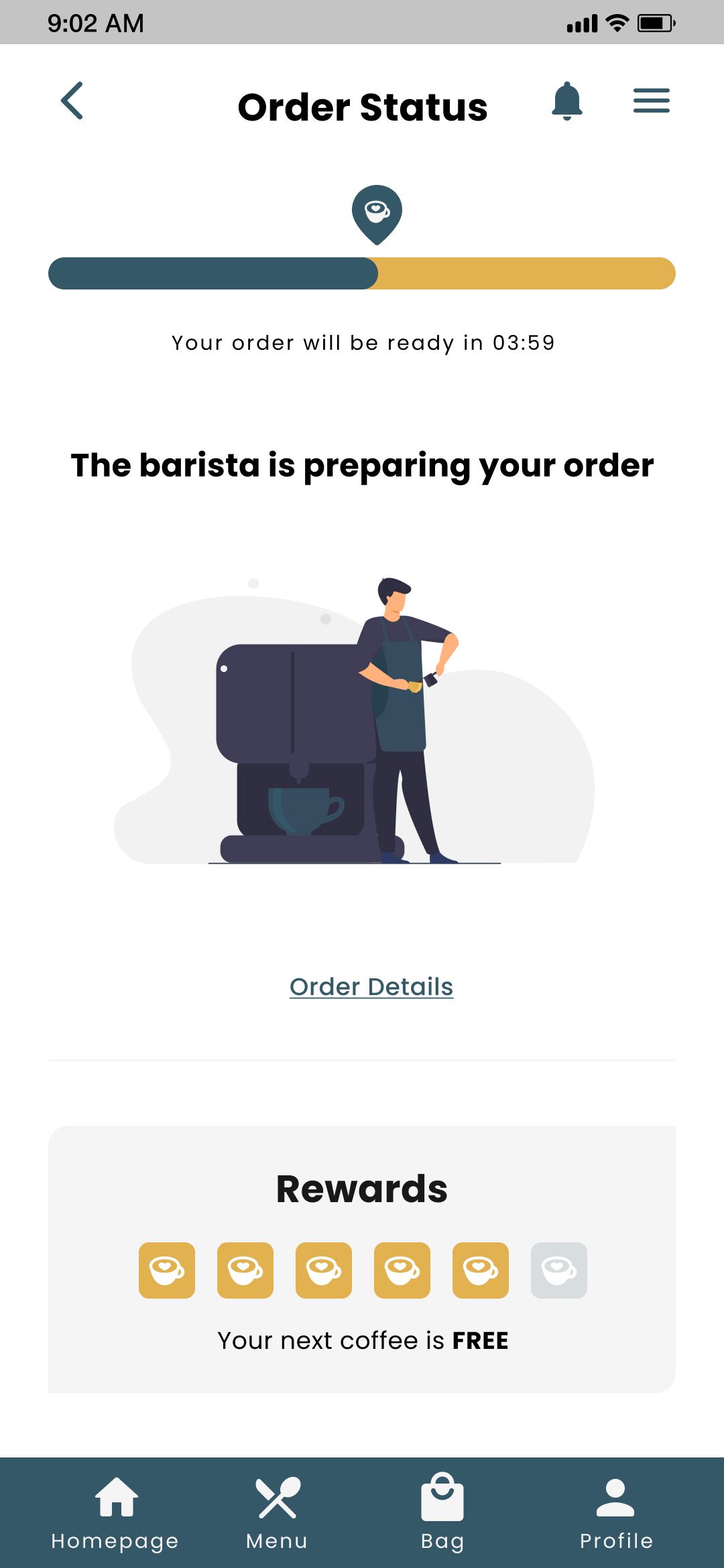
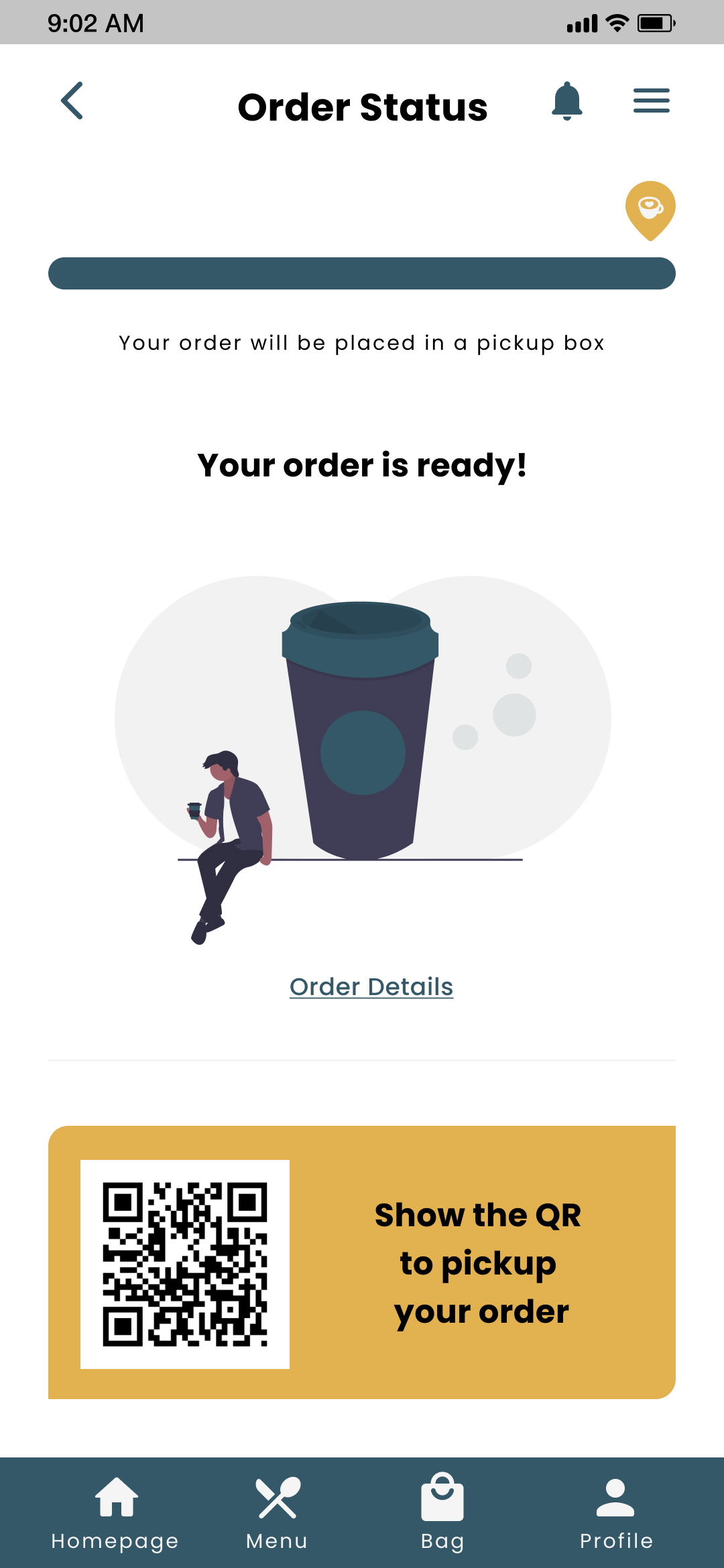
Order status
The order status will appear after completing the checkout. Users can check how long it will take and their order details. A QR will appear when the order is ready.
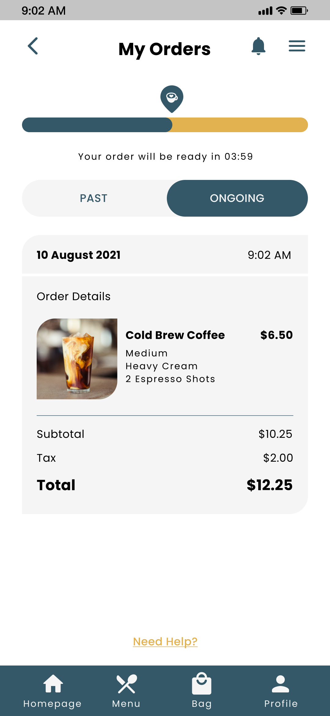
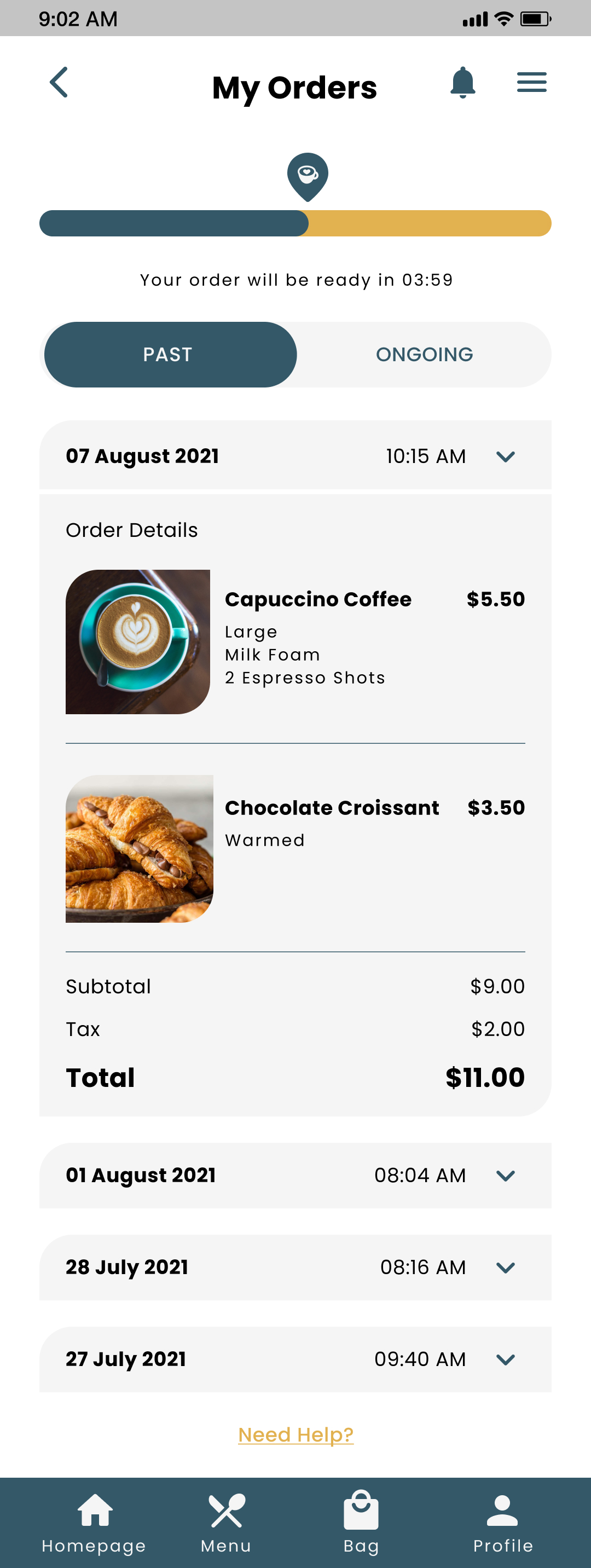
Order details
Users will find their order information in the "Order details" where they'll find information about ongoing and past orders.
Style Guide
01
Logo
03
Color palette
05
Icons
Accessibility
What’s next?
Takeaways

Impact
Because this is not a real product, I have to take the feedback given on every challenge as the impact of the product.After the last review of Hi-Fi Prototype, this is one of the positive comments I got from a colleague on the certificate.

“This is by far the smoothest user flow that I've seen and you are the 6th person I have reviewed. Excellent work!”

What I learned
Working on a full UX/UI project as an individual taught me to be more organized on the tasks I have to do, learning to prioritize and make only the research necessary and the changes users needed.
The course taught me to consider accessibility, be aware of biases, and learn how to overcome them. I also learn how to think like the user, build problem and goal statements, and find the value proposition of the product.And last but not least, to learn how to give and take feedback.
Next steps

Collect more feedback to improve the product.
Learn more about how to make the product more accessible to all users.

Be aware of the updates on UX/UI trends, and see how they can be used in the product.


