Design process
Design thinking

Empathize
Find what users need and learn how to think and feel like them.
- UX research
- User interviews

Define
Define the challenge based on the information gathered about the users.
- User persona
- Competitive audit

Ideate
Brainstorm focusing on the quantity of the ideas more than the quality to come up with the ideal solutions.

Prototype
A scaled-down version of a product that shows essential functions.
- Wireframes
- Lo-Fi Prototype
- Mockups
- Hi-Fi Prototype

Test
Test the prototype with users.
Discovery
Research and Analysis

One of the challenges of being a photographer is finding the “perfect” spot to take good photographs. On this topic (and after realizing that there are only a few failed websites and apps like mine), I saw an opportunity to create a mobile app where photographers have the chance to share their favorite locations, along with their pictures and short descriptions, with other colleagues.

Some key findings I noticed were that photographers find it hard to find new photography locations even in the city they live in. A pain point noticed was that photographers usually share their places only with close friends and some groups of photographers (they don’t like to share their favorite spots on social media).
Key research questions
[Needs] What is crucial for the photographer to find the “perfect spot”?
[Behaviors] Do photographers share their particular places? Have they ever used an app to find new spots?
Key findings
Photographers share their favorite places only with a close group of photographer friends, but when they search for new ones, they ask groups of photographers or search on Google. This proves that even though they share their information only with a select group, they need something to show them where the best places are.
This product is brand new on the market, so I identified opportunities to build on the features the photographers need. Also, the digital product needs to have a motivation to make photographers feel comfortable sharing their pictures and places.
Sharing locations
All photographers would share their locations with their close photography friends and some groups of photographers.

“I know some people like the mysterious hidden landscape to be only found for those fortunate travelers but I think it’s more honorable to share these beautiful hidden areas for all of us.” P9
Locations details
Photographers said it's hard to find new locations in their city or when they travel. Also, that is important to plan the route before they go shooting to see the topography of the place or to know the area.

“Most of the places are difficult to enter or you have to pay to take pictures.” P2
User persona
After analyzing the user research data, I created a user persona that helps understand the user’s needs, behavior, goals, and frustrations. This fictional character summarizes and communicates the data collected in the research in a more accessible way and allows me to design the project having the user in mind.

David
“Anyone can take a picture...a person with a passion sees the picture before it’s taken”
Demographic
Age: 20
Location: California, USA
Goal
- He would like to make photography a full-time job
- He would like to travel around the world doing photography.
- To have one of his photos displayed in a magazine or exhibition.
Frustrations
- He’s new at photography and doesn’t have friends as photographers.
- Photographers can be selfish with their techniques or places they know and won’t share them with new photographers.
- He doesn’t have too much money to spend on gear.
Design: Concepts & Sketching
Following the interviews, surveys, and gathering data, I identified the key points and opportunities. Then I brainstormed features, and once I prioritized these features ideas, I sketched how I would like them to look.
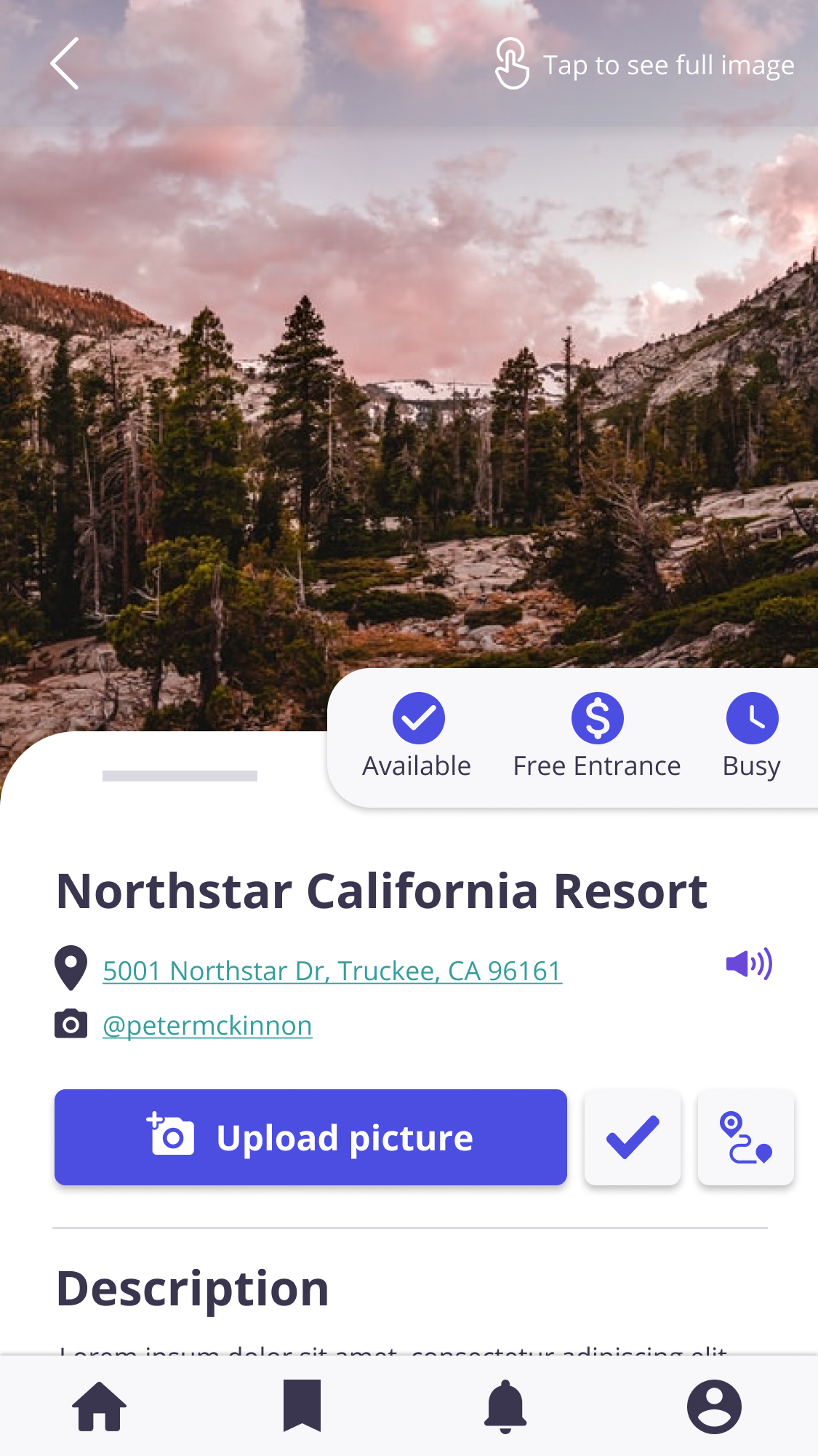
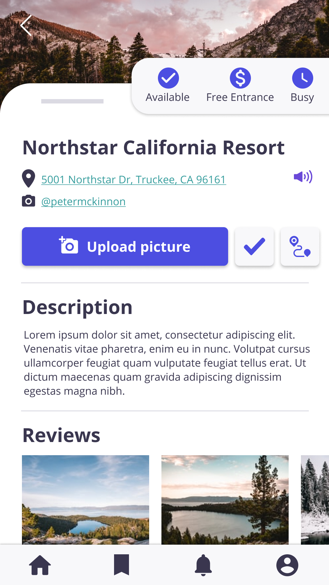
One of these key-finding solutions was to create a feature where users can see the details of the locations, such as if it’s a busy place, if it has any cost to enter and if it is available for everyone. Another key-finding solution was to create a feature to keep the photographers motivated when uploading their favorite locations.
Develop: Prototyping
I created the user flow for Photonomadic. Based on this, I designed the first Lo-Fi Prototype, which was tested by some users to obtain feedback and improve it. In the images below, you'll see some reviews given by the users on the usability study and the corrections made.
Design: Iteration
In the first iteration, the most relevant insights were:

Four participants didn’t finish the task of “see more information and upload a picture.”
- On the search result, they usually go back and then get lost because they couldn’t understand if there was more information or if it was all.
- Some users thought there was an upload picture button somewhere else, not on the location page.

Three participants asked about the difference between the homepage and the search page because they didn’t understand why both pages looked the same.
- One of the participants suggested adding a “saved locations” button instead.
- Most users didn’t understand if all the categories were already displayed or if they needed to do something else.
Digital wireframes
Lo-Fi Wireframes

Hi-Fi Wireframes before usability study

Usability study
I established a specific task for the users who participated in the usability study using the tool “Lookback.” These are the feature to improve:

Users didn’t understand the upload pictures icon. They also asked for a directions button.

Users seemed confused when trying to tap on the categories.

I added button for accessibility options.
Mockups
Here are the final mockups after the usability study and re-design of the wireframes based on the user’s needs.
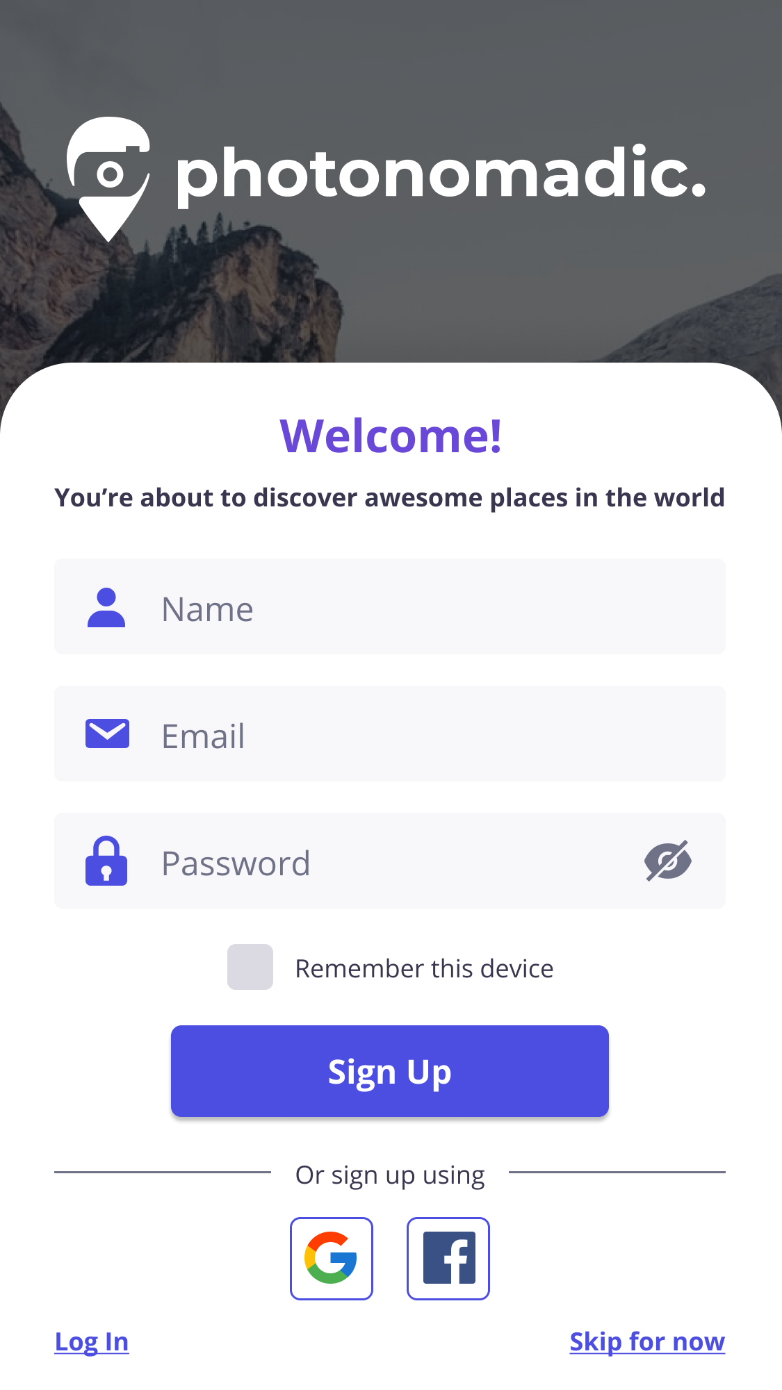
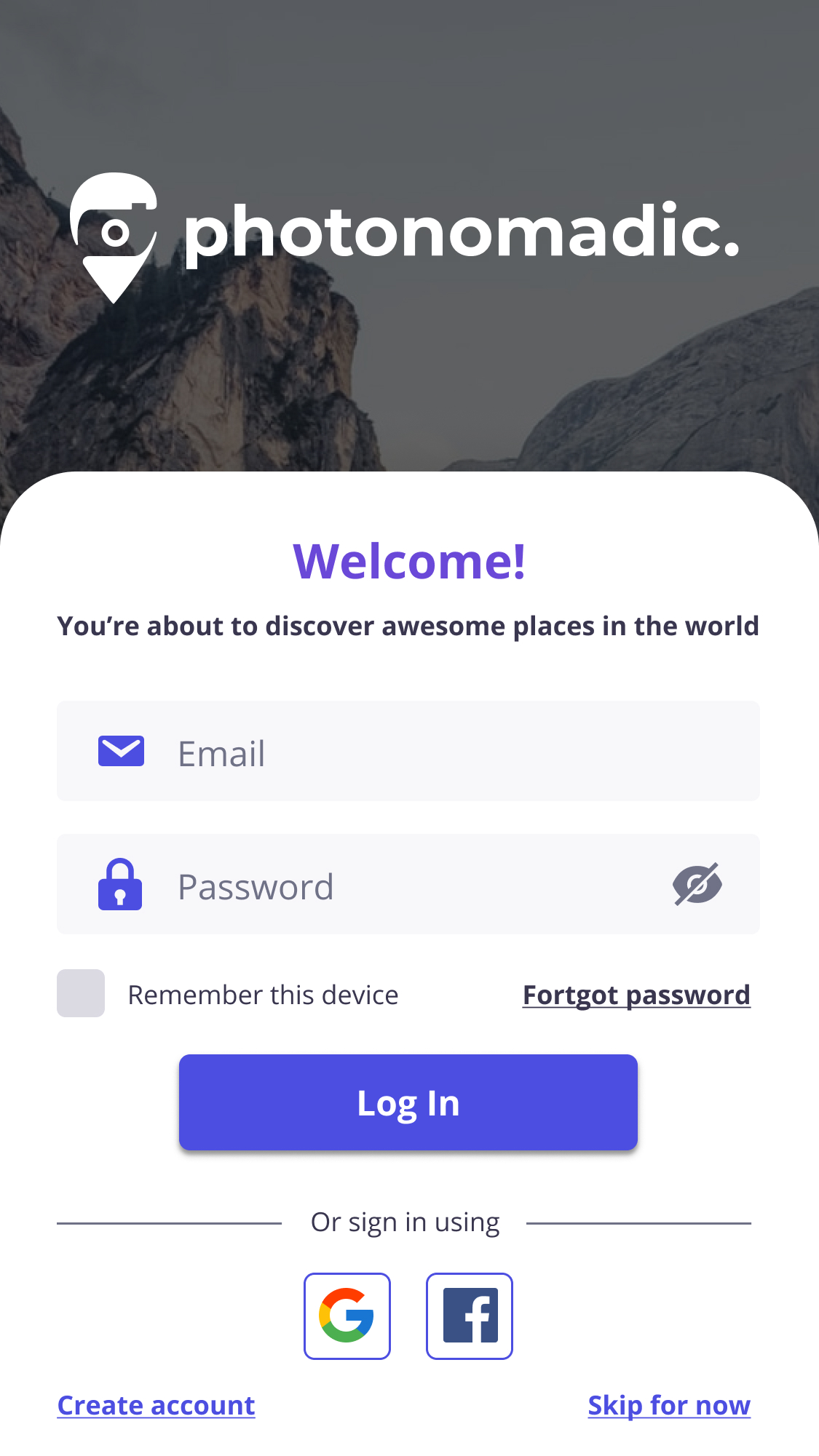
Sign up and Log in
Users fill the text containers with their information to sign up or log in. It also has an easy login using Gmail or Facebook.
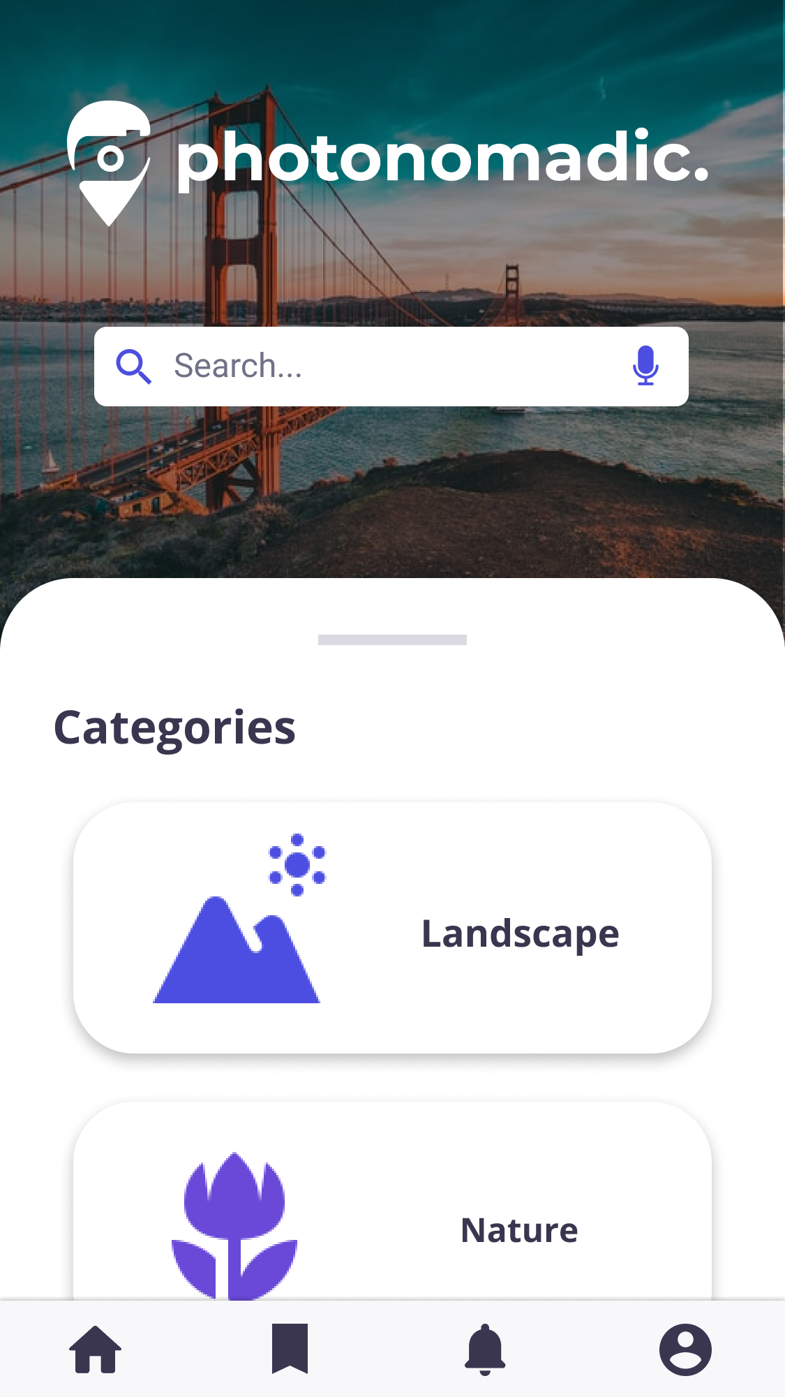
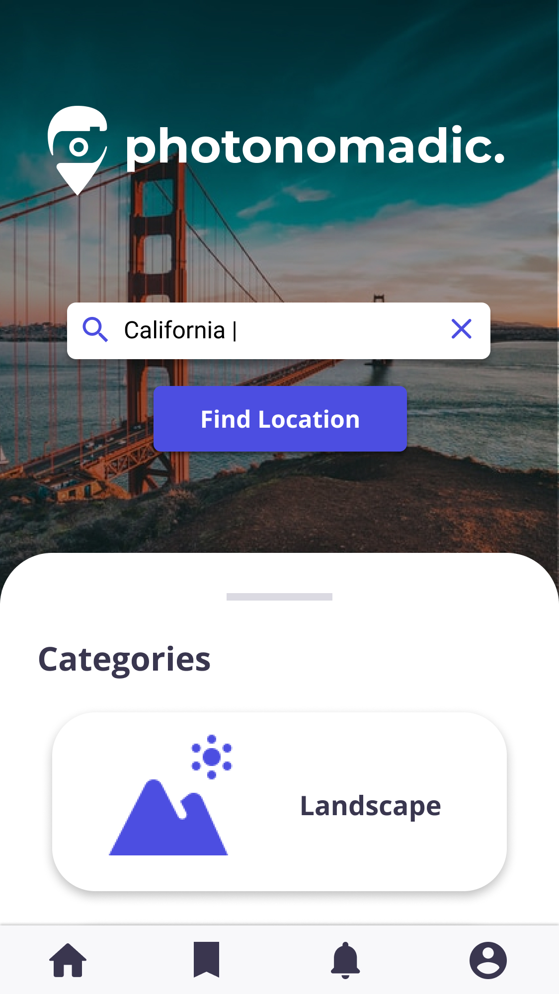
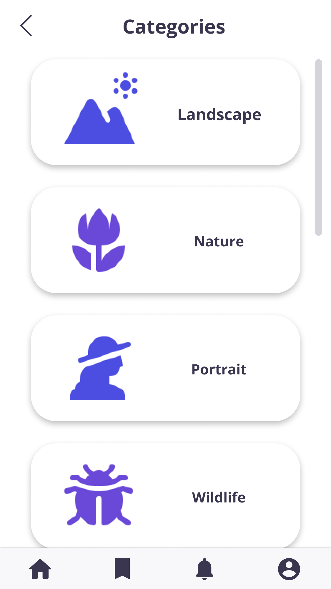
Search and Categories
Users have two options to search for a place. They can swipe up to see the categories or type the location directly in the search bar.
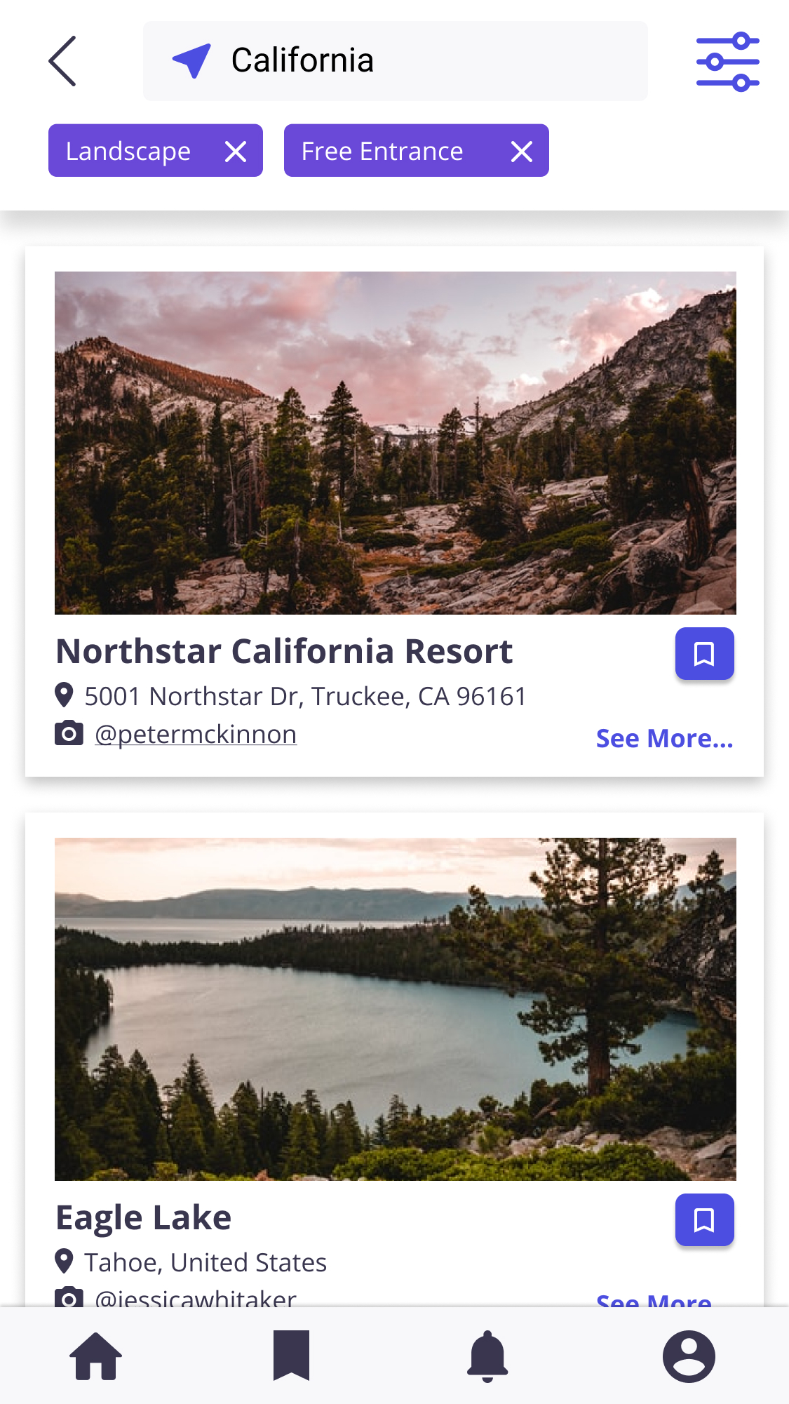
Search result and Location information
After searching, users will see the places with some information and a saved for later button.In the location information wireframe, users will see all the details of the place. The users also have the option to upload pictures and interact with other photographers.
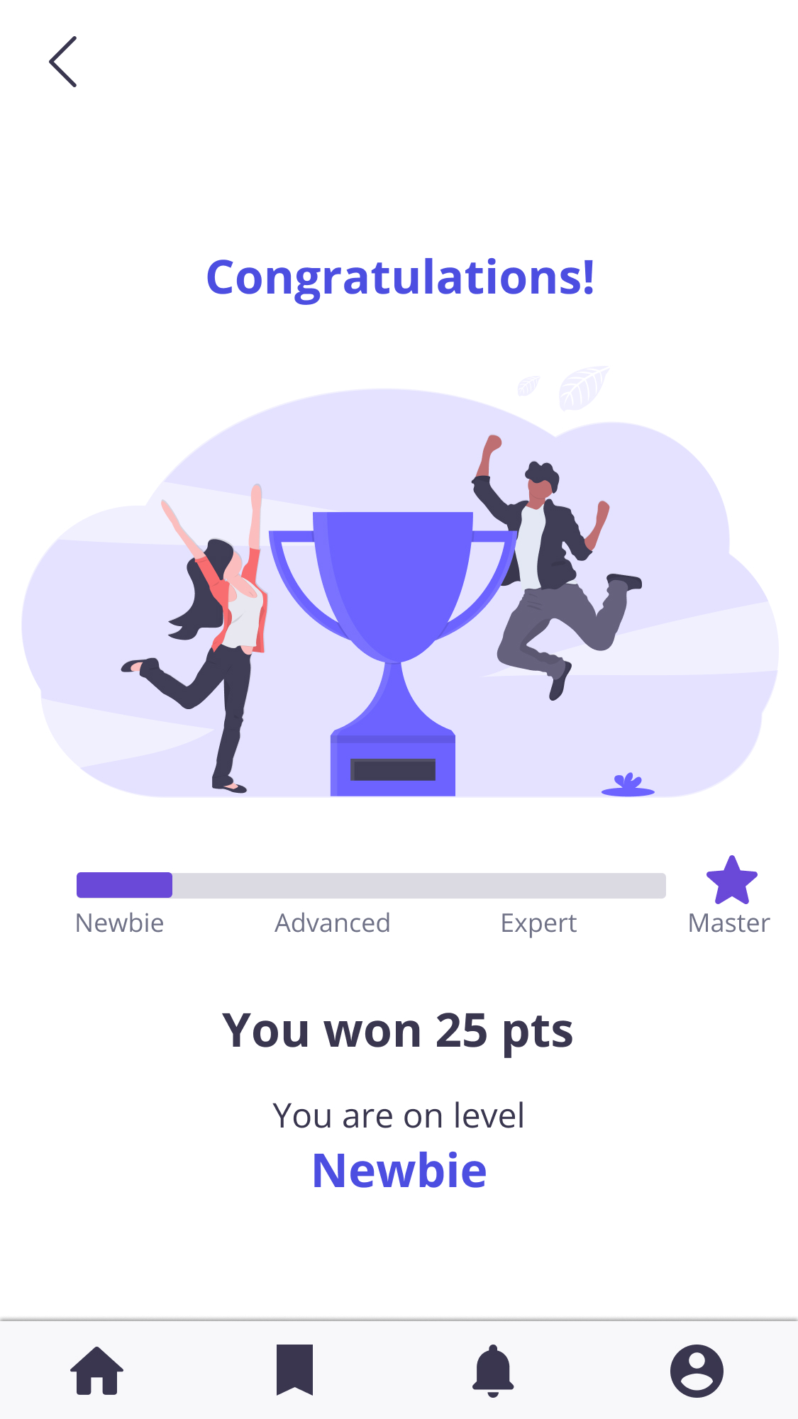
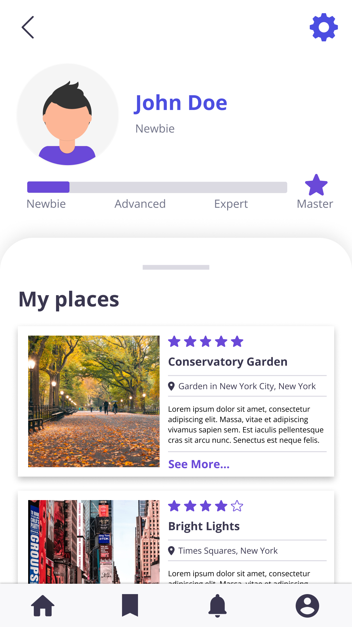
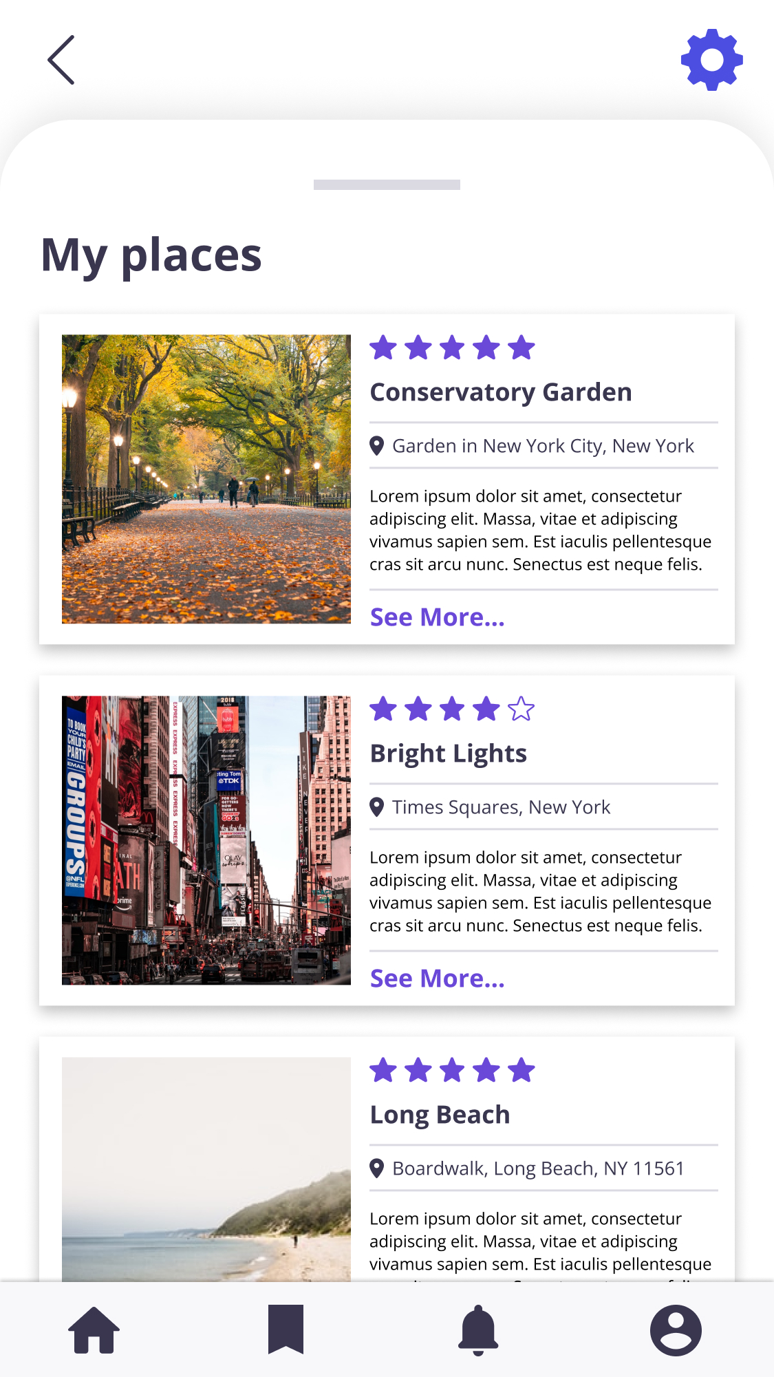
Rewards and My Account
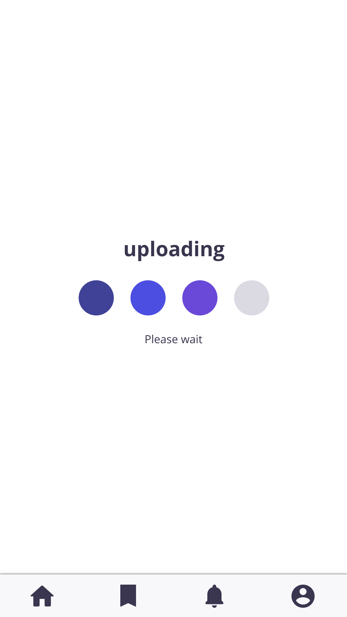
After uploading a picture and writing a review of a place, the user will receive points to level up.
In the user account, they can see the level and the places they’ve reviewed.
Style Guide
01
Logo
03
Color palette
05
Icons
Mobile mockup
Validation and usability
After the second usability study, users provided interesting feedback to improve features from Photonomadic.

40% of the users got lost trying to see the details of a particular location. Users also got confused by the function of the upload button.

30% got lost on the task “display all categories” these insights made me change the design one more time to have a great task success rate.
Accessibility

The website and app use the color combination approved by WCAG.

Add usable focus indicators, fields with text instructions, and sound buttons.
Feedback

What I learned
Most of the participants loved the app. In the feedback I received, the participants said the app was well-designed, clean, clear, with "nice features," and easy to use.

“I love how clean and well design this is. It’s very clean and clear, easy to use and has nice features.”